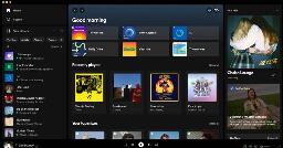
Spotify Desktop app gets a new look and upgraded library features | Engadget
 realcaseyrollins@kbin.projectsegfau.lt to

engadget.com
Spotify has updated the desktop app with plenty of visual improvements and new features, like a “now playing” view that gives you immediate access to merchandise and tour dates.
You are viewing a single comment
I despise the new library view, I cannot just double click my playlist folder to start playing anymore, I have to right click and go down to the play option now... Also feels very massive like it wasnt made for a mouse pointer. If it were up to me i'd revert to the old one in a heartbeat.
It's almost impressive how badly they screwed up the library. Absolutely hate it. It's just a massive chore to use versus how it was.
Huh? I had the redesign for a few weeks already and I can still double click playlists in my library. Only annoying issue I'm having is a wide unnecessary black bar when using spotify in full screen on MacOS.