COSMUnity


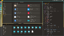
It will be possible to configure COSMIC to look like Unity out of the box. There's only a few panel applets that need to be implemented to make the experience 1:1.
You are viewing a single comment


It will be possible to configure COSMIC to look like Unity out of the box. There's only a few panel applets that need to be implemented to make the experience 1:1.
It should be noted that COSMIC itself hasn't been delayed. Development on the core applications progressed much faster than expected, so we decided to skip the Alpha 1 release and release Alpha 2 instead.
Why wouldn't you like using it right now? I wouldn't call it "very alpha".
Thanks for the reply!
I find some things confusing to use. Like maximizing/tiling windows my dragging them to screen edges doesnt work. I think documentation about the tiling would be awesome, as meta+arrows also didnt do anything.
It seems the tiling is only active when using tiling mode? That mode is slick as fuck, but having super+arrow always available or at least the tiling applet always shown would be great.
I am also not a fan of the color scheme, which is too black and I would prefer a less aggressive "active window" border.
The screenshot tool is very minimal but works well, its hard to reach a (bugfree ;D) KDE spectacle.
Same with the Filemanager and Editor, Dolphin is the best piece of software in existence, I love it. Kate is also great. (Main dolphin features: filter, search, preview size, column selector, custom right-click actions, custom buttons, custom places bar with custom names and icons,
And there is this issue with 3rd row symbols and keyboard layout not working at all. I have an en-GB keyboard, en-US either has no 3rd row or this is actually not working, and I also needs to disable capslock and use it to switch between 2 layouts.
The app menu has no "show all apps" view which makes searching a pain for me. I also prefer the layout of either GNOME (showing all apps with folders and rearranging) or KDE Kicker (WinXP like with search and favorites).
I will try and see what my problem with the search was, because that would probably be my preferred way.
The ability to remove the top panel, and to resize the applets independently of the app icons is crucial for creating a laptop-friendly one-button-panel layout. The GNOME-style only makes sense in GNOME I think.
Style-wise I think it already looks great, and its snappy and modern and has better dual-monitor support than Plasma 5, which is kinda crazy.
Disclaimer: using the latest ublue cosmic 40 image, no idea if the RPMs are up to date.
The editor is meant to be a regular text editor. If you want a code editor, there is https://lapce.dev/
It's funny how I find cosmic-editor to be perfect for code too
Nice, I already tried that editor. Thanks!
The best source seems to be COPR titaniumtown/lapce