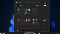
Windows 11 is getting a new start menu. EDIT: this replaces the "all apps" page by default, not the home screem


More info about it here: https://www.ghacks.net/2024/08/13/windows-11-start-menu-is-getting-a-new-layout-to-organize-your-apps/
I love how microsoft never learns their lessons.
You are viewing a single comment
You can see your phones status and recent messages from the start menu now! More start menu icons are exposed in the space they’ve added an organization mechanism. I think the point is to improve its usefulness
My personal phone is not linked to my computer. My work computer will never be linked to my work computer because I don't have a work provided mobile phone. I do expect this new menu to nag the shit out of me to link a phone based on prior Windows 'features'.
I don't use windows messages.
I see fewer icons in the preview image than I see on the start menu now.
This is far less useful than the existing menu, which is less useful than the windows 7 menu. This is like how they hid half the things I used on the right click menu under the 'show more' option.
Pretty sure the bar goes away when you don't use Phone Link! I use Phone Link, as you should too assuming you own a phone. I like it because that + the iCloud app basically brings feature parity to my Macs built-in Phone integrations. The simping over Windows is bizarre, it's like you guys are pissed that Windows 2000 isn't still supported, come join us in the 21st century please. "Any feature I don't personally use is pointless and bloat" is a childs argument.
"Everyone else should be subjected to my preferences" is also a child's argument.
If i wanted a Mac I would buy one. They are great for people who like them, but their extremely integrated environment is used to justify exclusive software and hardware requirements that I don't want to be limited to. Windows forcing an online account is aping Apple and I hate it.
How am I subjecting you to my preferences? Phone Companion disappears if it's disabled, you're upset because Microsoft added icon groups. How dare they upgrade your operating system, the monsters. In a world where they could have plastered it with ads, no less!
Calm down, I just have a different preference than you.
You guys are admonishing Microsoft for investing in good improvements. Your preferences aren’t the issue, it’s your framing of any change as aggressively bad without justification that I take issue with. Other than you not personally using the feature, you have no justification whatsoever for your complaints. It’s just ignorant whining, and it only serves to set back an OS that desperately needs the overhaul. This whole sub seems fucked, it’s not just you.
EDIT: I've given this some thought and arrived at a POV where I may have been too hard on you. Maybe there's a need that speaks to folks like yourselves, who are tech savvy enough that you're on a Lemmy instance but really just want a prototypical Windows experience. To my mind, that's crazy but here we are so I must be wrong on that front. I admit there's nothing inherently wrong with that, it's just annoying you're in the same user base I am - someone who wants Windows to improve finally. Maybe we can agree that Microsoft should just go back to Windows 95 and cater to you guys, and leave modern computing to the professionals.