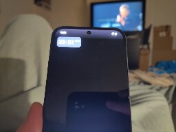
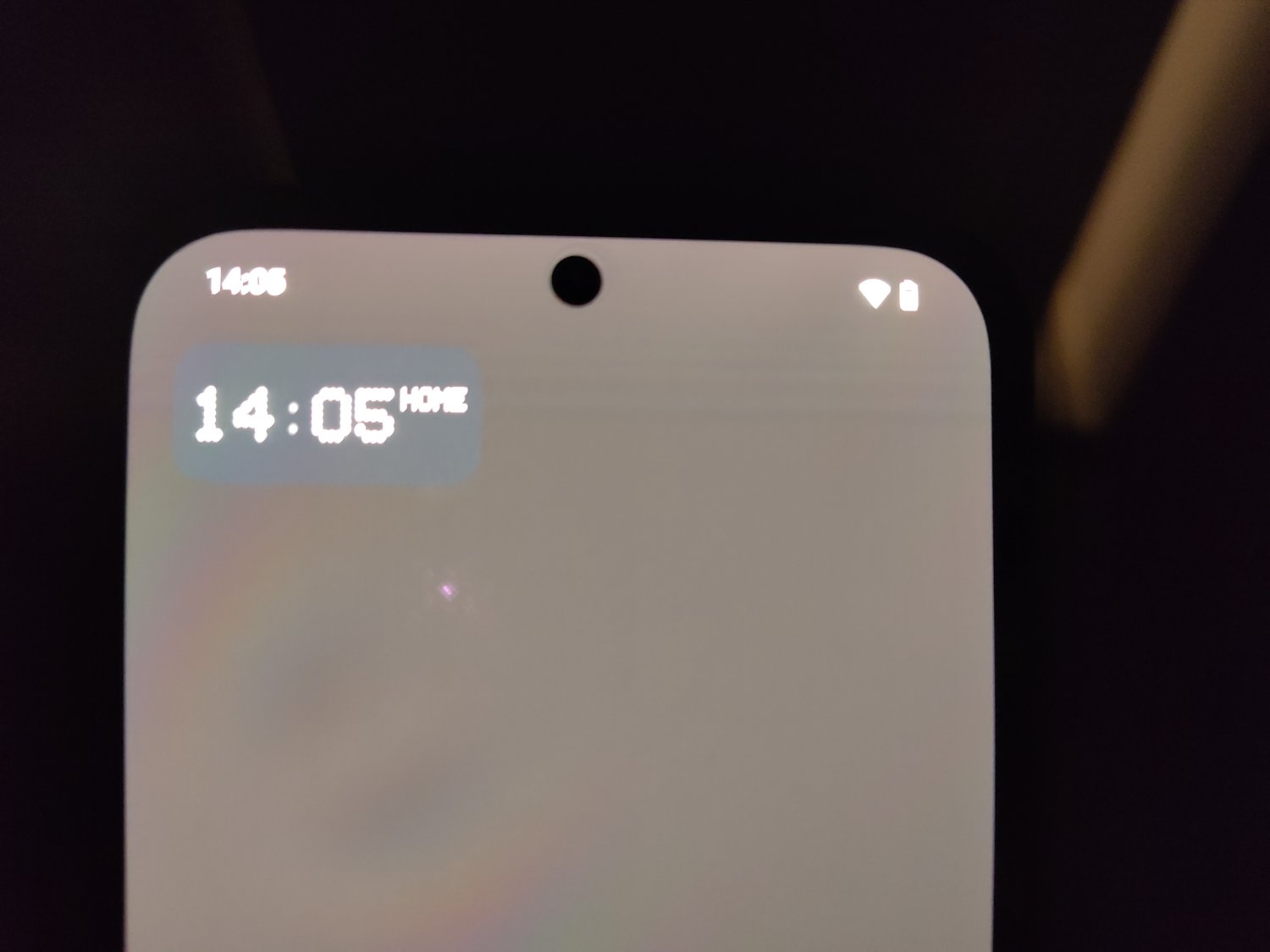
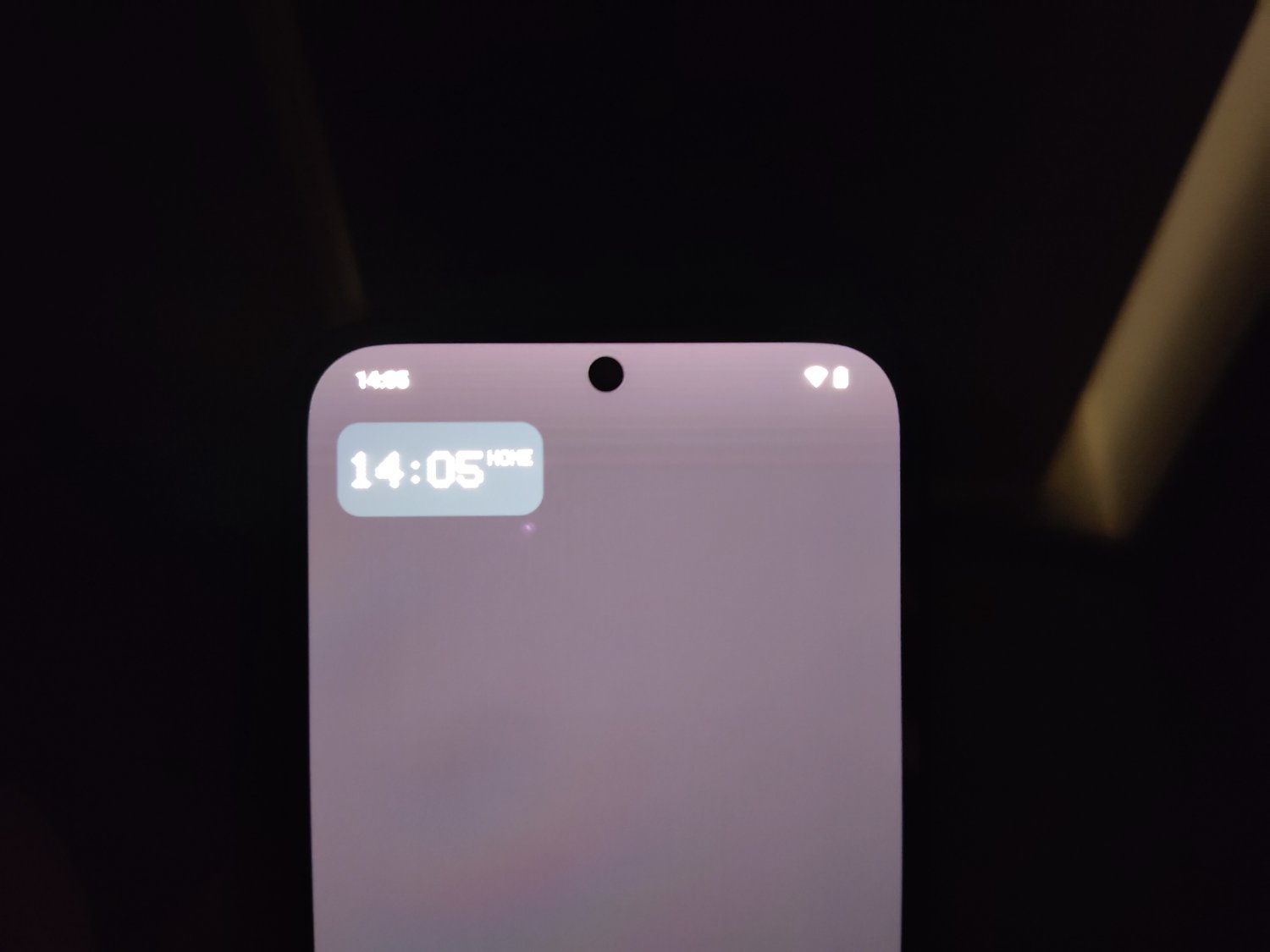
I noticed a white hue on the top of the screen and ONLY on the homescreen. I thought it was a Fairphone 5 issue, but now i noticed it on my Nothing Phone 2a (photo)as well. What is it?


Haha no, it is not.
Why is it the best? Why does it stand out? Why do you recommend it? A little more info etc would make this post seem much less like an invasive ad... Edit: this as reply to you comment: why the downvotes
I guess Settings App -> System -> Feedback. But i think this is an OS feature request (like Jet in the other comment said), which is being handled by the manufacturer of the device you're using instead of the actual AOSP. I'm not sure where you can leave feedback for AOSP, if that's possible at all. Hope someone else can add that here.

It does.
Go to settings -> apps -> the app you want the restriction gone -> the 3 dots top right
I think you can turn it off there. It is an extra security layer design by Google, because without that restriction and with the access turned on, the app can see pretty much all your touches and swipes, notifications and whatnot throughout the system etc. Edit: spelling
True! And to be honest, i kinda checked it again after your comment... (With no luck)
That is what Fairphone said. But then, why do i have it and others don't? And why does this happen when i'm using a fully black wallpaper? It should be visible enough already...
Really? I double checked on my other phone, there it was visible as well...
Hmm, i still notice some fade effect.. Edit: same on both devices.


Yep. I've seen it happen in brighter backgrounds too: but instead the fade will be a little darker (it does not happen on a white only wallpaper tho...) I was afraid it was an actual "feature", and this all kinda comfirms it. For now, a launcher will be the only "fix".
I agree. Sadly the Fairphone 5 is still running Android 13... A14 is "planned" to released this summer
Fairphone is dropping some balls when it comes to software. So much that in its current state, i can't recommend the Fairphone 5 at all. Plenty of issues. They need to hire better developers/software designers and probably more of them too.
I've had contact since november, and only a few weeks ago (after i had to sent it to the repaircenter in France, i live in the Netherlands) they could tell me it was "an intentional design choice"; so the notificationbar would be more visible. I sent it to them because of the hue, because they first said; "it looks indeed suspicious". So... Yeah...
I'm not familiar (although these kind of things is what me made leave Moto), so i can't help you with any information about it. However, why not trying ADB to remove Motorola bloat and see if the issue's still there?
Man it is sad to see what has become of Motorola these days... Will probably never get another one if they continue the bloat and invasive software. How i loved my Moto G2 back then...
Hmm... I understand why you say that. But the thing is, my Fairphone has been send to the repaircenter for this exact reason. I got the same one back because there was no fault present in the screen or phone.
The funny thing is, the same thing happened for other people:
https://forums.androidcentral.com/threads/white-fade-at-the-top-of-home-screen.983310/page-2
Notice the guy saying: "oh, it actually shows up on a screenshot"? And i don't see it there too. Edit: actually i do, but indeed much less then when taking a actual photo.
This is just weird man...
Yeah, it looks way worse on my original photo, because brightness was turned on to the max. On Fairphone it is a little worse then on my Nothing phone, but not that much.
That was actually one thing i also thought! But then i thought, why only do that on the homescreen? Because even the lockscreen misses that "feature".
Nope. My Nothing Phone 2a came in yesterday, and i've tested my Fairphone for it already.
Well, that's nevertheless somewhat odd. Fairphone and Nothing have different stock launchers. I think they just modified the standard launcher and thus used a "feature" that was included in the first place? All things point to an actual intended design choice which can't be changed.
Yes, the white fade on the notification panel.
Different launcher does indeed fix the issue, but that's such a shame because i really like the stock ones already.
I hope that Google releases more tablets and give landscape orientated designs a little more love, something that is currently falling behind by many many apps (many don't have that options at all). That could really make a difference once they DO decide to implement desktop mode.
Maybe they could experiment with some forced landscape mode or something? (If that does already exist, let me know because Nothingphone has removed homescreen rotation for no reason).
I would like to see that coming more to smartphones anyway. Phones are so big these days, landscape mode gets really comfortable because of it IMO.
Yeah i've noticed it recently in Lawnchair. But thanks anyway. Terrible design choice from Google if you ask me...
Only on the homescreen
No, i used them as backgrounds on my homescreen. In gallery the fade is not present on your images.
Poor updates (policy), overpriced for the specs. I mean, 400-500 for a phone with a SD695 and 60hrz? Come on... Such a shame, because they are the only ones with a screen without a punchhole/camera cutout...
Nope. Because on the lockscreen and when i slide down the notification/quick setting panel, it is just normal, oled black.


While i agree and support a lot with what you are saying / trying to do, i'm not sure this is the right way to reach people. I'd say keep your blog going, but try find some nicer words and images and such (not the Anonymous kind of stuff..). The content comes off a little... strange (the word 'cringy' in the other comment was kinda wellplaced too), i hope you anderstand.
And i'm afraid most people won't be reached at all unless other ROMs are more (easier) available, like being pre-installed on devices you buy in stores.
Wished i could be of help in any way, i like your intentions and input!