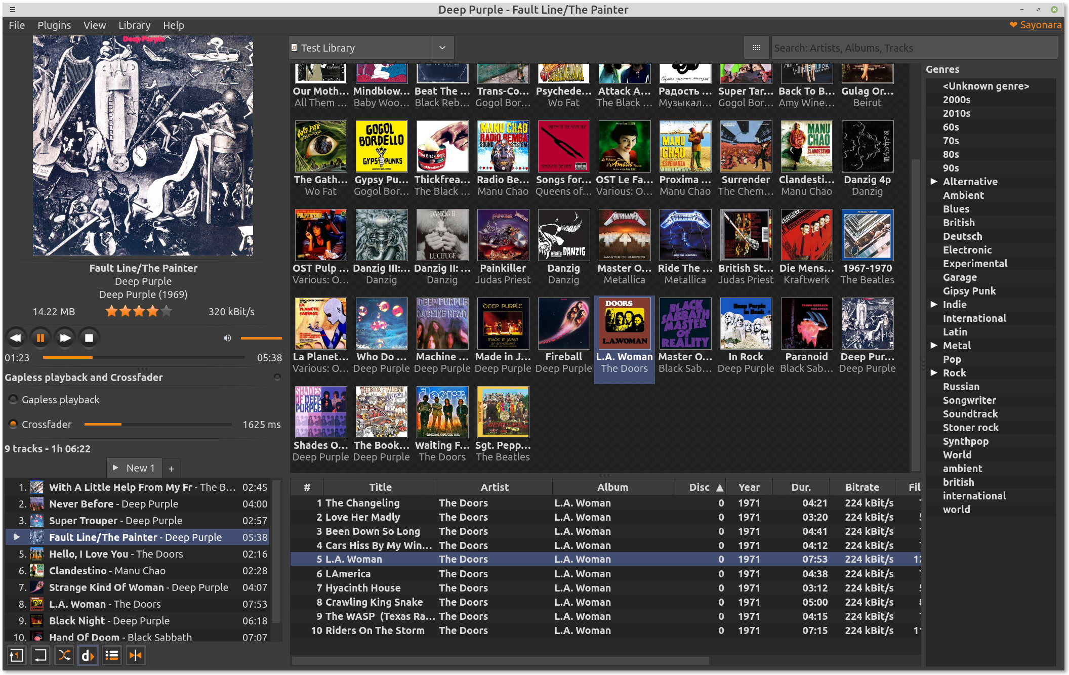
Dopamine. The best player after some years of searching.
Now it's completely dependent on Bing's results! I'd even say it does a worse job than Bing. I compared results for different queries and Bing was much better than Qwant! In fact, if you read their privacy policy, they sell your private data to anyone who asks for it.
I really enjoyed the game in many aspects, especially some of the mechanics and art style.
But I eventually dropped it. Two reasons:
Honestly, if they added some depth to the core mechanics and complexity that depends on skill rather than random events on the map and resource types, it would be one of my favorite games. As it is...
Agreed. I'm using the native Windows version, written in C#. The developer stopped updating it because he switched to a cross-platform version. I take his point, as not everyone has experience with the technologies that are available on all systems. Electron is the solution. However, even the older version has all the features I need and an awesome UI/UX!
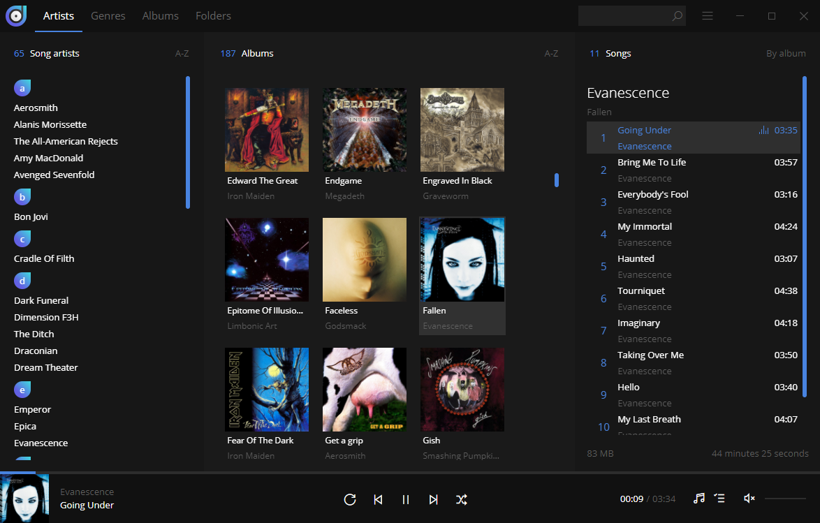
I would recommend Sayonara Player for Linux. It's not as awesome as Dopamine, but I still love it. I couldn't find anything better for Linux!
I fell in love with Tenorite.
Wow. Does anyone share software from "the russian hacker" Valdik outside the RUNet? That's the first time I've seen it.
I've read that tedium. Some chapters revealed something interesting, but everything else was empty. Why do I need to know what kind of wine the developers drank and in what pub after the bad news got announced to them?
This book's core issues are very important. The book itself sucks!
True. Popular books being read by millions of people have no reviews. That's why I'm on the LibraryThing now.
Wow! This is the first time I've heard about Knaben Database, but it looks handy. Thanks a bunch for the recommendation.
[Edit]
Yeah.
The video author can enable a setting to analyze the comments. YouTube itself flags comments that it deems inappropriate. The author only chooses which videos to include this tweak and the level of strictness.
It is enabled by default.
Comments that may be spam, self-promotion, gibberish, and otherwise potentially inappropriate will automatically be held for review in YouTube Studio and will only be published if you approve them. If you want a higher level of protection for your channel, increasing strictness will increase the number of comments held for review.
Oh, it'll be easy! Everything I'm about to explain is written by its authors in the Microsoft note.
=
Look at the characters, for example, "a", "e", "g". They have bulk shapes with a minimum of lines compared to Aptos. And now for my personal reasoning.
What is the most common case of reading the folk will have? It's lack of light or twilight (subway, auto, office, home room, etc.). It's a small screen size (smartphone or laptop). It's a low PPI. This is the distance of 20-35 cm, or about a meter, to the screen. These are eyesight problems and astigmatism. These are the points (and more!) you must consider when creating a font.
Here's my example. I have pretty good eyesight and a little astigmatism (only need to wear glasses when working long hours). I mostly surf the internet using a 17" laptop. I sit a meter away from the screen. That said, I have good illumination.
While using serif fonts, my eyes get tired after hours of reading. This is because astigmatism causes characters to have a subtle shadow at the edges of the lines (if there are pixel artifacts on display, it doubles the effect!). So fonts like the EB Garamond are generally unreadable for people like me.
Also, the brain needs a fraction of a second to figure out what the character is. E.g. the Tenorite's "a" and the Aptos' "a". I don't confuse it with anything else when looking at the Tenorite's "a" and it goes much smoother while reading. The characters don't blend into one mess for me.
As the authors said, they created a font "comfortable to read at small sizes onscreen". If it's comfortable on small screens, it will be the same on larger screens. On a 32" screen, almost all fonts will be OK. I could increase the font size on the small screen, but then it would be uncomfortable to read because of the smaller amount of content.
Based on studies, the better the font reads, the worse we are at memorizing information. But there's not a lot of actually significant information on the Internet, and I do more writing than reading. So that's not my point.
Thanks for a recommendation of Comic Neue from one old Reddit's thread. It's a wonderful font for reading in low reading environments. Seems Tenorite has replaced it for me, as it looks more common and has thicker outlines.
P.S. This is just my own geek standpoint, I didn't/am not in the typography business.
100%!
If we want to know where any form of society is on the political spectrum (left or right), we need to answer one question: what's the state role in society? The weaker the state, the more to the left on the spectrum. The stronger the state, the more to the right the formation is. In addition, we can also differentiate between formations by the economic form of society. These two points will give us an exhaustive answer.
Examples:
There are occasional exceptions to these definitions. For instance, at the beginning of socialism there can be a strong state, that must then disappear. The USSR was like that, but it didn't get to complete socialism.
So liberalism is a centrist ideology. For some topics it's left of center, for some topics it's right of center.
Might be helpful to someone: flibusta.is, flibusta.site, flisland.net. Flibusta is the largest pirate library in Russian.