Soaking in the worst air quality in the world


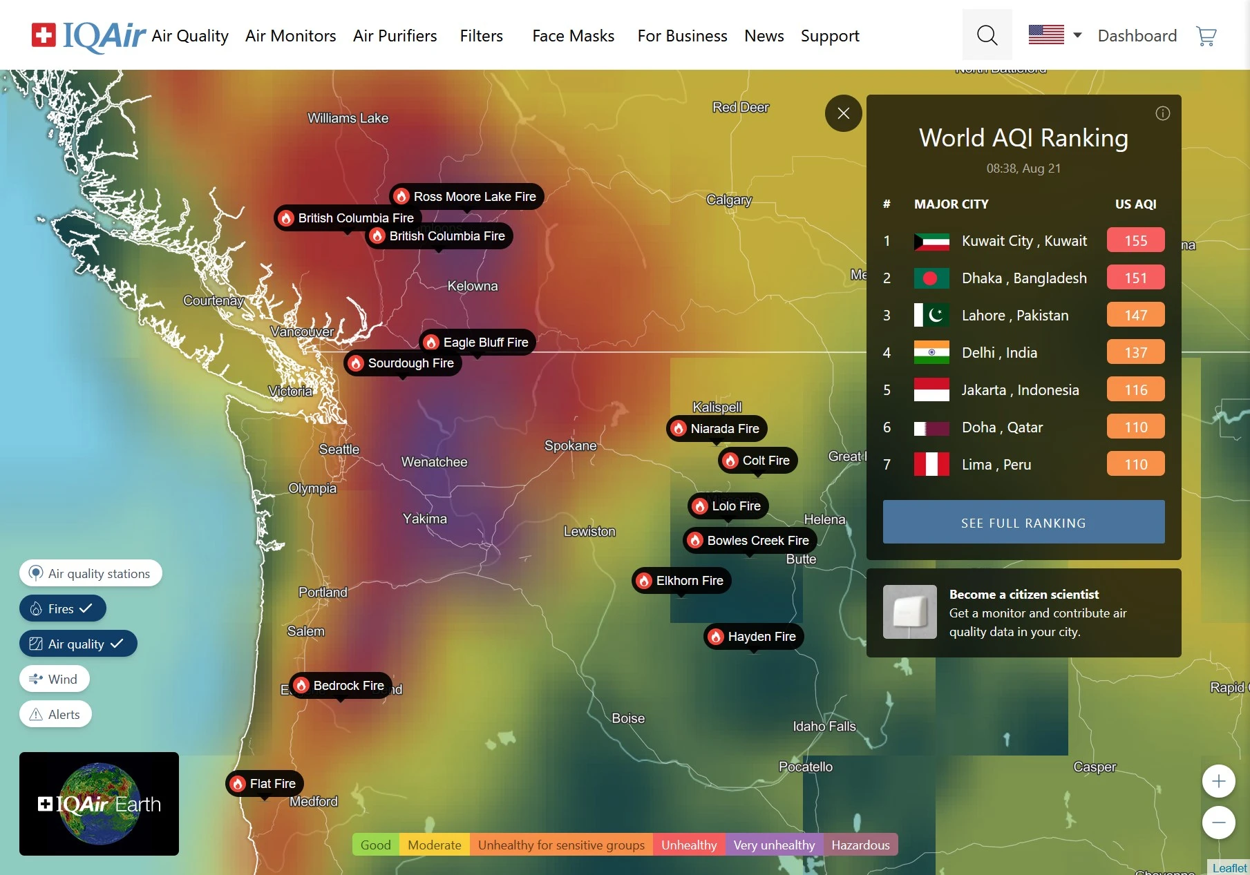
The Air Quality Index in my town is currently 260 (very unhealthy) due to a surge in wildfires in western Canada and the northwest US. There are additional smaller fires not shown on this map at this zoom level.
From the interactive map it looks like the worst air in the world right now.
You are viewing a single comment
There's a reason for it, or at least an explanation for the odd color scheme. I don't exactly remember cuz I heard it on NPR in the background. It goes something like red is bad, purple is really bad, and the people coming up with the color scheme never imagined something really really bad so maroon(red+brown) was just suggested for really really bad. And the smoke has gotten past really really bad in some places.
https://www.npr.org/2023/06/28/1184894545/how-purple-came-to-be-a-scarier-color-than-red-on-the-air-quality-index
Mauve is next logical color IMO
There's already maroon after purple starting at 300, but that's the last one since at that point it's just plain hazardous already. But considering it was over 800 when I was in Beijing several years ago, and it was over 600 in Spokane WA where a friend lives and several other places this weekend, we probably need a point at which we evacuate people and a color for that.