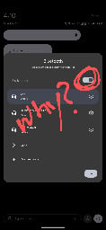
We heard you like toggles so we put a toggle in your toggle.


This toggle is annoying because what was once 1 press to turn on BT is now 2. It gets me every day.
You are viewing a single comment


This toggle is annoying because what was once 1 press to turn on BT is now 2. It gets me every day.
When you edit your quick-access tiles. Mine has a little pencil if I expand the notification area fully. I have these choices, where 'Internet' is the annoying combined WiFi/data button, but the other two were in there and I just had to drag them out instead.