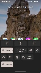
iPhone-style dash, wish Android had this by default


Ever since I switched back to Android after a couple years of using an iPhone SE, i have been missing the iOS feature to open "control center" (iOS term for quick shortcuts) using a swipe up gesture from the bottom of the screen.
This is a great feature that eliminates the need to reach for the top of the screen to pull down the notification shade to access toggles for commonn settings (wifi, cellular, BT, hotspot, torch, etc.). Since we live in an era of huge phones such a feature would have been extremely convenient. Unfortunately it's not implemented in Android.
But I accidentally stumbled upon an app called Neo Launcher that has implemented a similar functionality (kind of, since iPhone control center can be summoned no matter what app you're using, but this only works on home screen).
A dashboard pops up from the bottom of screen, where your thumb can easily reach, with a user-defined shortcut! Toggling wifi and other settings are much easier this way.
I'd highly recommend everyone to give this a try. Personally I've set double tap on screen as a shortcut for the dash.
But, like, you can do something similar by pulling down twice. That screen can be configured to show almost any toggle. Different actions, similar results. Is it the actions you don't like?
The toggles are still at the top of the screen. The bottom of the screen is closer to the user's thumbs.
This
You could do the circular swipe from right to bottom to enable one handed mode (pixel exclusive or it's standard? In this way the screen becomes half size) and then the vertical swipe (or a swipe on the fingerprint sensor) from top to bottom to show the quick notification bar
It definitely needs some time to practice though because the circular swipe to enable one handed mode interferes with the back gesture
Yeah as you said you have to swipe down twice and strech your finger to the top of the screen (or use the other hand). Definitely a bottom dashboard is more convenient.
If the argument is that swiping down twice is more difficult than swiping up once, then I agree. If the argument is that swiping up once should be reserved for system toggles, then I disagree. I believe it's a question of properties, not capability, when it comes to Android's decision.