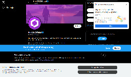
I just wanted to take a moment to enjoy how clean the web can be


I happened to click a link that took me to the associated twitter X account for something I was interested in and was greeted by not one, not two, but four modern day web popups.
I know it's nothing new. I've got a couple of firefox plugins that are usually quite good at hiding this sort of nonsense, but I guess they failed me today (or, I shudder to think, there were even more that were blocked, and this is what got through)
What's the worst new/not-signed-in user experience you've encountered recently?
You are viewing a single comment
This is so common it has a name, it’s called banner blindness.
One of the important aspects of interface design is supposed to be not showing alerts for everything, so that when they pop up you feel compelled to pay attention.
Not long ago a nurse killed an older woman by giving her the wrong medicine; she took accountability but called out that the software they use provides so many alerts that (probably unofficial) policy was to just click through them to get to treating the patient. One of those alerts was a callout that the wrong dosage was selected and she zoomed right by it out of habit.
Another term I seen in the context of healthcare is alert fatigue:
https://en.wikipedia.org/wiki/Alarm_fatigue
Automation engineer here: alarm management is a hugely important part of making a plant operable.
It is also a project that is never done, you must always review alarms that come in and see if they are providing useful information and what the operators are supposed to do with said information.
If the operators are not supposed to do anything with the information, then what is the point of having the alarm?
Same when setting up Nagios, after a time you learn fewer alerts is better