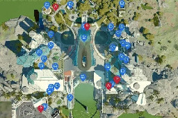
Here Are Some ‘Starfield’ City Maps, Since The Game Doesn’t Have Any
 stopthatgirl7@kbin.social to

forbes.com
Starfield's maps are not defensible, but fans are already starting to fix them.
You are viewing a single comment
 stopthatgirl7@kbin.social to

Starfield's maps are not defensible, but fans are already starting to fix them.
Tbh Bethesda has never really been great at maps. Even skyrims is a little jarring
"A little jarring" is being very generous. For me, Skyrim's map is one of the worst maps I've ever had the displeasure of using. Skyrim is a grey game with grey landscape, and the map really emphasizes how grey everything is: grey land with grey icons on top and grey clouds covering most of the landscape (such a great idea). I don't mind that the map is 3D, but the camera angle limits is what pisses me off, they seem to choose the worst possible angles to showcase the map. There are no road markings whatsoever, and the LOD is so low that you can barely make out any feature on the map (considering you're lucky to find a patch in the map that isn't covered by the grey clouds).
I know that Fallout's maps are bad as well, you can barely see shit in them except for the markers, but at least it's in theme with the game, so it gets a pass. Starfield's is in theme and is pretty much like the Fallout maps, but the fact that there's literally no other features make it terrible as well, but I much rather have a completely blue screen with some markers spread around than trying to navigate Skyrim's map.
Oblivion's where it's at. They should have expanded on what they did there: simple 2D maps that are in theme with the game, clearly depicting main roads and some minor paths and simple depictions of the main cities' walls.
I just wrote a little jarring because I frankly didnt play much of Skyrim. I know, I'm such a heathen ;). So I was just going off of memory. You're right that it's bad though now that I've looked at videos of it.
I wonder if it's done on purpose to make the world appear larger?
We've all been hoodwinked
Perhaps. I think in terms of Fallout they may have made the maps kind of "stylized" like how the rest of the pip-boy is, but it definitely didn't make the game very fun. Especially when I was lost in one of the many maze-like dungeon levels and the map just wasn't helping.
The indoors Fallout map is the worst thing ever. I don't think it's ever once helped me out of a jam or cleared up confusion. If there are multiple levels (and there always are) it's all just slapped together in a single plane on the map so it makes less than zero sense.
Yeah. The worst case of it I've seen is in the "Come Fly With Me" quest in New Vegas. The indoor area is split into two sections each that are both multiple floors, and both of the floors vary surprisingly not at all in the way they look. Especially the underground section. The quest has you navigating the whole building about a dozen times too, so it just becomes a nightmare.
I honestly didn't think about this but I kind of fell like a lot of things where done to hide the limitations.