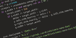
I have a confession to make... I code in Comic Sans


dtinth.github.io
Seriously, though, Comic Sans was originally designed to be legible at the smallest possible font size, and the lack of hard lines makes it easier to read!
You are viewing a single comment
I will forever believe the comic sans hate is one of the internet's seemingly random circlejerks, like hating Imagine Dragons.
There were legitimate reasons from a design standpoint. It's badly balanced, the spacing is inconsistent...and it was everywhere.
Funny enough, I suspect what makes it a badly designed font might be why some people with dyslexia have an easier time reading with it. The badly balanced, poor spacing, probably made the letters in the font more distinguishable from one another.
If you (or anyone else that's interested) have the time, I think this article, "Why You Hate Comic Sans," goes over all of it pretty well.
I've heard that too - part of the issue with dyslexia is that it's easy to flip the letters around in your head, when none of the letters look the same, it makes it easier to read. Open Dyslexia is another one that does something similar.
I recently read a review of 1990s pop aesthetics, and it was probably intentional for reasons that resonate with us again. In the 90s, with the advent of omnipresent computers, organic, amateurish handwriting became really popular, and I think that's what comic sans is good at looking like.