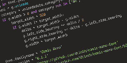
I have a confession to make... I code in Comic Sans


dtinth.github.io
Seriously, though, Comic Sans was originally designed to be legible at the smallest possible font size, and the lack of hard lines makes it easier to read!
Seriously, though, Comic Sans was originally designed to be legible at the smallest possible font size, and the lack of hard lines makes it easier to read!
Oh no now I want to build a whole Arch rice around that font.
...no that's not enough.
we need ComicSansOS
Holy man! If you ever do that. Please post! On unix porn as well!
Is there a Lemmy community for that yet?
I tried that this morning at work, as a joke.
It was still there when I got off.
Giggity.
undefined> Wingdings
After two days, what do you think?
Still using Comic Mono, I really like it.
I'd just like to slightly increase the letter spacing. Some portions of code felt a bit too dense. Maybe I'll try to tweak that after my vacation (as of today, 8 days without a computer)
Wonderful! I also installed Comic Mono yesterday kept it until now. So far so good. Yeah you are right, sometimes the code feels a little bit dense. If you do something about that, please give us an update.
BTW enjoy your vacation!
Wow, poor comic sans didn’t deserve all the hate it got
⚠️ I have reported this post to the proper authorities.
Title is misleading, it's a monospaced derivative of Comic Sans that's actually nice, not actual Conic Sans.
Conic Sans is the hyperbolic version of Comic Sans
I miss RES's context feature now. Thank god this thread wasn't too long, so I was able to find my comment you replied to in it in a reasonable amount of time.
i already do that while playing undertale so no losses
I will forever believe the comic sans hate is one of the internet's seemingly random circlejerks, like hating Imagine Dragons.
There were legitimate reasons from a design standpoint. It's badly balanced, the spacing is inconsistent...and it was everywhere.
Funny enough, I suspect what makes it a badly designed font might be why some people with dyslexia have an easier time reading with it. The badly balanced, poor spacing, probably made the letters in the font more distinguishable from one another.
If you (or anyone else that's interested) have the time, I think this article, "Why You Hate Comic Sans," goes over all of it pretty well.
I've heard that too - part of the issue with dyslexia is that it's easy to flip the letters around in your head, when none of the letters look the same, it makes it easier to read. Open Dyslexia is another one that does something similar.
I recently read a review of 1990s pop aesthetics, and it was probably intentional for reasons that resonate with us again. In the 90s, with the advent of omnipresent computers, organic, amateurish handwriting became really popular, and I think that's what comic sans is good at looking like.
My original intention was to come here and proclaim that you're a heretic. Having looked at it for a moment, I think that you're onto something here...
same here... just right now downloading the font, thinking if I don't at least give it a try, I'll forever wonder what it'd be like...
Comic Sans is actually really good for dyslexic people. It's why I usually use Comic Sans or Comic Neue when I print stuff out for my dad.
There's also Dyslexie and a similar open source version: https://opendyslexic.org/
Ngl that is really easy on the eyes. Dammit.
I…don’t hate it? Why am I not horribly offended by this?
I think some of the reason might be that Comic sans used to have really bad kerning. But with a mono font it is not really an issue.
I feel the same way. I hate that Iike it and am now going to try it.
Same thoughts here. Went in expecting to hate it instantly and found that it sort of looked nice.
Oh no, I was ready to pick up my pitchfork, but that is super legible. Brb, I need to go take a look at myself in the mirror...
Definitely makes sense considering some dyslexic people have found it helpful in terms of legibility
Yep, it shares a lot of characteristics with fonts like Dyslexie, but without some of the more irritating (but helpful) gravity additions that throw off non-dyslexic readers and/or just look odd.
The additions throw off some dyslexic readers too, I've always had an even harder time reading purpose-built dyslexia fonts. Comic mono is top tier for me, it still looks stupid but the readability is incredible.
I've coded with comic neue https://comicneue.com/ over the last few years. I would definitely recommend it.
That's amazing, I love it. Thanks for linking that!
As long as it's a monospaced font I don't really care what the font is. (Wingdings excluded)
Might give it a try for a day.
I feel like a whole new world has opened its doors to me. I’m using this tomorrow at work.
I've taken to sending screenshots of things lately, and sending comic san terminal output would be epic trolling.
Haha you have to share how that goes! Today I changed my IDE over to comic mono and I’m waiting for the time someone wants to pair program. I won’t say a word about it, I’ll pretend everything is normal.
This is surprisingly not bad...
I've been using it for a while. It's pretty great.
I unironically love Comic Mono. I am not dyslexic, I have good eyesight, but I feel like I can read code so much more easily with it versus most other monospaced fonts.
Friendship ended with font gatekeeping and dogpiling, accessibility is my new best friend
somehow this doesn't offend my eyes the way comic sans usually does
Great to find another Comic Mono user! It's super easy to read. I've been using it in IDEs / Terminal for a while now.
I've even set up Stylus scripts to use it in GitHub and other sites as I find weird going back to the "normal" code fonts.
That's interesting, how can I make GitHub use Fira Code of that's what I'm used to?
I use an extension called Stylus which allows you to inject css into sites. I have a general rule that overrides the font-family for pre / code elements. There's a great community around it for custom styles for various sites - offering dark modes, decluttered views, alternative themes etc.
Cool, thank you!
Need to give this a go at work tomorrow!
If you like that, check out Recursive Sans & Mono
I wouldn't pick it over Fira Code but it has a bit of whimsy to it that reminds me of Comic Mono.
Really dig that for a new-wave ui
It's interesting that you added serifs and monospacing to a sans serif font. It's almost like comic sans but with all the things that make it comic sans removed.
Well it is Comic Mono after all, not Comic Sans Mono :)
Seriously, for coding I use daily Fantasque Sans Mono, which is based on Comic Sans. I love it.
Ohhhh that looks super interesting, i can see how that might build less fatigue
A dude posted his neofetch on a Linux community and he uses fucking comic sans for his terminal. Probably will rot in hell
Saving that font for my e-reader tablet.
Suuuper legible and fast to read.
Yeah, I'm surprised how much I like the look of this. I'm into it.
At least you’re using a monospaced one…
I mean Comic Mono is mentally relaxing and legible so great font of choice
Does it support ligatures??
Comic Code is my go-to!
Yep, been using Comic Code for a while now - people hate me when they see me use it (and to be fair, outside of a terminal / IDE I wouldn't use regular Comic Sans either) but I suspect they've never actually sat down and glanced at it for a while.
I tried using Comic Mono for coding once after seeing this video about Comic Code. Honestly it was a pretty good experience.
Me too man! Been using it for over a year now, coming from Fira Code. It's actually a real enjoyable font to look at.
omfg this is the perfect demo font
I unironically really like Comic Mono despite not super being a fan of Comic Sans (not cos it looks bad, I think it's actually really nice looking, just overused)
I keep thinking about switching to this font. I use Fira Code atm, and I'd miss the ligatures, but this genuinely looks a a lot more readable
It's actually very common font for dyslexia
I came here to get mad but comic sans monospaced looks really good. I'm impressed. I might switch my IDE to this.
Reducing the font-size makes it look pretty great.
Yeah but does it have ligatures? That's my hard pass on coding fonts.
not a crime. i use it for my notepad, it looks weird but its fine for me.
Look what you have done! I used Operator Mono for Italics. I kind of like this!
bro... how did you manage to stain a screenshot
Is it that bad? Now I have IBM Plex installed
First of all, how dare you
Second of all, how dare you
Third of all, at least it isn't papyrus
Papyrus!!!!
I see serifs. You're a phony! A great big phony!
That looks sooooooo nice
Who knew? Just make it monospace.
Fantasque Sans Mono
I'm so hard rn
Haha, this is one and only one thing in my life that I don't want to change, never ever :D
Staring at code for 8 hrs a day, my eyes thank you.
I used to use Ubuntu mono but now I use Jetbrains Mono but damn that comic sans looks better than I'd expect I might even give it a try!
pfft! Real devs use wingdings!
I'm going to try this after trying Intel's new font that's supposed to be made to accommodate for vision impairment.
https://github.com/intel/intel-one-mono
It's not bad, but I hate the braces.
It's not even monospace
Whoever owns this whole server can you ban this guy. This is a crime to humanity
Wow, that's kind of amazing. I'll be trying it out now. Thanks!
Goddamn it...
installs the font on his computer
WolfgangsChannel also recently said he used a comics sans-lile font
LOL. Love to hear it.
Shit I might just try this out. I hope my colleagues don’t notice.
Every PR you make is going to be denied.
I don't care it shows up as my BitStream Sans Mono, I know you write in comic sans, DENIED.
Tough, but ultimately fair
I was addicted to coding with Comic Mono and ended up purchasing Comic Code. No regrets.
Stumbled into this site while looking through other comments and apparently it was designed for the speech bubbles of a cartoon dog, not sure about the "legible at small sizes" claim - http://www.connare.com/whycomic.htm
Blatant trolling should be banned! Get the pitchforks everyone! :P
This is cute~! I hated comic-sans when seeing it on lots of tacky corporate and school signs etc. but recently I ironically and then unironically fell in love with its whacky-ness, bold-ness and readability, (I use a Samsung phone, and used PT Mono on the S9, but then future phones blocked custom fonts, so I used one hack-ey Comic-Sans version since my mono ones are so underground no one developed a phone hack - now any font is possible again so I'm using the one below~ )
A few years ago my fav. font became PT Mono, from Google Fonts - cyrilic compatible, it has these angular edges, and swoopy circle curves, so cute <3
THEN there was this font printed on 2011 Pentax Q cameras and lenses that I loved, and couldn't find the original, but there was something very similar, STALKER1 and related similar fonts
PT MONO
STALKER1
That actually looks pretty solid, will have to try it out.
I'm normally quite easy with fonts, for monospace it's usually Fira Code, but for certain tasks I like to use something different.
For instance, terminals usually it's ProFont, and for IRC it's Fantasque Sans. Fantasque Sans is kinda like Comic Sans.
Hmm... maybe I am a bit particular about fonts after all.
ProFont looks quite nice, pretty similar to Terminus Font that I usually use in terminals.
I don't hate it? If this had ligatures, I would consider actually using it. I use Fira Code Retina for now but I'm always down for more options
Comic Code has ligatures, but it's not free. Still $30 well spent for me. https://tosche.net/fonts/comic-code