Minnesota panel chooses new state flag featuring North Star to replace old flag seen as racist


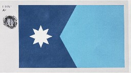
Minnesota’s new state flag should feature an eight-pointed North Star against a dark blue background shaped like the state, with a solid light blue field at the right, a special commission decided Tuesday as it picked a replacement for an older design that many Native Americans considered offensive.
The State Emblems Redesign Commission chose the final version on an 11-1 vote after finalizing a new state seal that depicts a loon, the state bird. Unless the Legislature rejects them, the new flag and seal will automatically become official April 1, 2024, when Minnesota observes Statehood Day.
The star echoes Minnesota’s state motto of “Star of the North.” The commission’s chairman, Luis Fitch, said that to him, the light blue represents the Mississippi River, “the most important river in the United States,” pointing to the North Star. But he acknowledged it could mean other things to other people. Symmetry and simplicity won out over other versions, including ones that included a green stripe for the state’s agricultural heritage.
I liked this choice. The tri-color seemed a little busy to me.
I agree. I do like the tri color and would have been happy with it, but there’s a quote from whom I cannot remember that essentially is “flag design is finding the perfect flag and then dialing it down a notch”. And to that end, I think it succeeds wonderfully.
It’s modern but classic. Detailed but not busy. Inclusive but not all-encompassing. It’s pretty amazing.
I am glad they changed the star design; I think the new one is much better.
My only gripe with the alterations of the submitted design is the star shape change.
I loved the big points in the cardinal directions with smaller points in between. I dislike this eight-pointed star.
They were both good, but I think they made the more-refined "high-brow" decision by going with fewer colors.
I'm actually jealous of this flag. Only downside is it's kind of hard to see against the blue sky, lol.
I think the 2 tones of blue make it look more like a basic corporate design than "high-brow"
Do you like places with stickers everywhere?
Not particularly, but I'm also not bothered by the presence of more than one color.