Minnesota panel chooses new state flag featuring North Star to replace old flag seen as racist


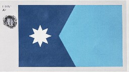
Minnesota’s new state flag should feature an eight-pointed North Star against a dark blue background shaped like the state, with a solid light blue field at the right, a special commission decided Tuesday as it picked a replacement for an older design that many Native Americans considered offensive.
The State Emblems Redesign Commission chose the final version on an 11-1 vote after finalizing a new state seal that depicts a loon, the state bird. Unless the Legislature rejects them, the new flag and seal will automatically become official April 1, 2024, when Minnesota observes Statehood Day.
The star echoes Minnesota’s state motto of “Star of the North.” The commission’s chairman, Luis Fitch, said that to him, the light blue represents the Mississippi River, “the most important river in the United States,” pointing to the North Star. But he acknowledged it could mean other things to other people. Symmetry and simplicity won out over other versions, including ones that included a green stripe for the state’s agricultural heritage.
Too bad they didn't go with the Polaris Tri-color. I agree with Grey that it was the best of the color variations.
I liked this choice. The tri-color seemed a little busy to me.
I agree. I do like the tri color and would have been happy with it, but there’s a quote from whom I cannot remember that essentially is “flag design is finding the perfect flag and then dialing it down a notch”. And to that end, I think it succeeds wonderfully.
It’s modern but classic. Detailed but not busy. Inclusive but not all-encompassing. It’s pretty amazing.
I am glad they changed the star design; I think the new one is much better.
My only gripe with the alterations of the submitted design is the star shape change.
I loved the big points in the cardinal directions with smaller points in between. I dislike this eight-pointed star.
They were both good, but I think they made the more-refined "high-brow" decision by going with fewer colors.
I'm actually jealous of this flag. Only downside is it's kind of hard to see against the blue sky, lol.
I think the 2 tones of blue make it look more like a basic corporate design than "high-brow"
Do you like places with stickers everywhere?
Not particularly, but I'm also not bothered by the presence of more than one color.
Tricolor was better. 120%.
I would have sworn my eternal allegiance to the Polaris Tri-Color. This one is nice, especially for a state flag, but not inspiring.
I recently finished watching that video and NGL the tricolor with less toned colors looked pretty beautiful to me.
I like that they went with the simplified "K" shape for Minnesota (the reverse triangle is really clever visually) but I did also like the more colorful version better. Just a little too plain now for me.
I don't even know what Minnesota's flag looked like.
Uh, no one is going to miss that.
Don't worry, Republican legislators are already in frothing rage about the change. I'm sure it has nothing to do with them wanting to keep the problematic imagery in the current one of native Americans being driven off their land. /s
Also they're spreading some conspiracy theory the new flag is supposed to look like the flag of Somalia or something and that this is a prelude to Sharia law being imposed. I wish I was joking. Yeah, because it has blue colors and a star in it, it must be an homage to Somalia, couldn't have anything to do with being the "land of 10,000 lakes" and "the north star state." Or even the old flag, which get this, is blue with a big star in it.
I also liked the version with the stripes better, but this is very nice too, and anything is better than the atrocious current one. The new seal with the loon is very nice too.
Other states that just lazily slapped their seals on to a blue background take note and get to fixing them up please.
New seal:
Libtard snowflakes don't even know what a seal looks like. It sure ain't looks like a bird, I tell ya
But loons are half bird/half seal with bitchin' red eyes.
And these morons gave it white eyes. Will the insanity never cease?
I have fantastic news for you, looks like the one I posted was revised slightly before approval. It's got the red eye now!
I was 100% joking, but that’s hilarious that they changed it.
I agree it's much better this way. Laser loon lives on.
This looks so metal! It's perfect!
They changed the words too! Idk what they mean though, the old words or the new words
Old words are the state motto which is in French, star of the north. New words are the Dakota name for the Minnesota river, from which the state derives its name. Some controversy over which barely visible words to go with. Both seem fine to me, I just want that red loon eye.
As a Virginian, I take slight offfense at this! ^but ^yeah ^our ^flag ^is ^just ^the ^state ^seal ^^on ^^a ^^blue ^^background
Loonie flag?
Why are the using the same bird as the Canadian money?
Is Minnesota signaling they intend to join Canada?
I wish! It's the state bird though. It's been the unofficial seal and symbol for some time already. And with all the lakes there are tons of loons.
No that was the tricolor variation that preceded this final design, and it actually did look like a Somalia flag. I think this one will be pretty well liked by pretty much everyone. The only people who won't like it will instinctively not like it because of the taint of wokeness as a motive to change it. Whatever. But at the end of the day, it was a trash flag and everyone will ultimately agree that it's better now.
Ironically the changes brought it closer to the actual flag of Somalia which is just light blue with a star on it (the three stripes were from some provincial flag, obviously cherry picked out of the many different flags with green blue and white in them to try and rile people up). I don't care though I think it was a stupid argument anyways. I liked the look of the stripes better, but I like this one too. Just was very tired at seeing the very predictable rhetoric from the right in response to a positive change correcting an ugly poorly designed flag. Glad there's a new one now.
Racism aside, it's like an ugly Christmas sweater in flag form.
I love it when someone can verbalize my feelings perfectly.
I cant make out the racism. Is that supposed to be a slave? It looks like a taco bell employee the way hes dressed
Native American on horseback.
How is that racist? Native americans are a big part of the state's history
It's a depiction (celebratory?) of them being purposely driven away from the land. The Native American is fleeing.
Wow. I saw it as the two people sharing the land. I did not see it as fleeing. Still a terrible flag, and even more so if it can be interpreted so differently.
Honestly? Even if it was unequivocally that it would still be a problem. The whitewashing of using violence to drive people from their homes and then pretending that they came to an agreement to share the land is just gross.
What if i see the indian circiling in for the kill?
Are we still using that word or did we figure that part out already?
i went to elementry school on a reservation, indian reservation was the parlance of the time. Kinda stuck with me.
Maybe time to leave that in your past. Around these parts that's not a word folks are fond of.
I don't know where "around these parts" is for you but I've heard plenty of people refer to themselves as indian or American Indian instead of Native American in my lifetime. Really many people would prefer you use their actual tribe name over either one, but it's most often white people getting bent out of shape over using "indian" in my experience.
Many Native American people prefer the term "American Indians", to be fair. There is a bit of a split on which one is preferrable depending on who you ask. It varies from tribe to tribe, region to region, and with age differences.
Most Native people would just prefer to be called by their tribal affiliation over either of the terms, but accept them as our collective terms for them. Many don't care which one you use because it's wrong either way, really.
This is just from my experience talking with some people from different tribes in my area, and from seeing the question posted on forums before.
That's true. But I was thinking the motif might be from before all that.
There really isn't any "before all that" though. Especially that far west. Along the east coast there might have been a generation of "we just want to escape weligious pewsecution and gwow cown uwu 👉👈🥺" but the first permanent settlement in Minnesota was in 1852, 7 years after the phrase "manifest destiny" was coined. Minnesota was established during the era where the prevailing belief of white Americans was that God commanded them to take all of America for themselves and anyone who tried to stop them was to be destroyed.
Oh, shit. I don't have that detailed knowledge of US history. 1852. That's almost 100 years after its founding, right? I had no clue it took that long to spread west.
Just two friends hanging out with their spear and their rifle respectively at hand
The rifle is just chilling. The dude's plowing.
Well that, unfortunately i guess is also a part of their history
Yes, but a flag is not the place to tell history. It usually depicts your ideals.
If Germany had f.ex. a shattered David's Star on their flag, that would accurately depict history. But it would read as antagonism and a current stance on things. As if it was their goal to destroy Jewish people.
It has to do with the setting. It's not just a Native American riding away on horse back, but the fact that the settler is watching him with his rifle near by. It is like he is driving him away and claiming the land for his own.
You're overinterpreting things. And despite that, it's exactly what happened. Historical accuracy is not racism.
Historical accuracy is not racism. Choosing to identify yourself based on the racist actions in your history is.
To drive it to the extreme, it would be like saying that Germany depicting Jews being gassed on their new flag isn't racist, just historically accurate.
That is a terrible flag even without the racism. A good flag should be clearly identifiable as an emoji or at least a stamp.
It's worse than the original design with the white/green/blue tri-colour on the right.
But still a big improvement.
I like how easy on the eyes it is.
It's actually pleasant to look at while not demanding your attention.
Solid flag.
CPG Grey will be so excited.
We need another "breaking flag news" update asap.
He provided an update, but last time I checked it was behind a members only paywall.
This is the only reason I clicked on this post as I reckonized this flag from his video.
Oh cgp grey's favorite won
It's still not the good colors though
I was gonna say I that looks like a flag cgp would love. Glad it's the one he approved of.
Cool. Now he should bring back HI instead of leaving its Patreon up for three years. I don’t care that it only collected money when episodes released, the optics of it matter.
HI?
Hello Internet
Relevant: CGP Grey Grades State Flags!
He did one about this new flag too! https://youtu.be/lFwwo0W5Ugg
Huggbees also does some flag reviews.
He also just recently published a follow up on this flag specifically.
The new flag is badass!
I just looked it up out of curiosity, and Minnesota's old flag is boring and generic AF. It was a member of the "state seal on blue" club.
As a general rule you should be able to roughly represent the flag in 10 seconds in MS paint using only the pencil tool. If you can't, it's a bad flag.
This flag you can do that the old one with the seal is terrible and you definitely couldn't because it looks like every other terrible state flag, with a seal.
You over estimate my ms painting abilities. That star would take me ages.
Big day for !vexillology@lemmy.world
We'll be trying to get our hands on a nice flag with the original design#1953 on it to fly outside our house. This one is fine I guess, but it stings with what could have been.
Cool flag. I like the solid light blue over the stripes that were an option, K.I.S.S..
Feel like with that simplified they could have done something with color a little more interesting than the dark blue to really emphasize the shape of that dark blue region but if you can't give this a 10/10 your standards are too high.
I liked the tri-color design, but this one is good too, like you said simplicity is best. The dark blue in the K shape is shaped like the state, so the solid color fits.
Anything is better than the seal on a blue sheet
Yeah, flags like those are just generally bad.
What the hell happened to the star‽ They took away its twinkley starriness. Now it just looks like a blurry circle
64 bit ==> 16 bit
That looks really nice.
It looks better when you see it as Godzilla firing his atomic breath.
This is a great choice. That flag is probably now the best one in the Union.
In my opinion Mew Mexico and Arizona are both better. I hope this encourages more states that are just "blue field with state seal" to make better flags. New York really needs help 😅
Colorado has a C on it!
Ohio's is the only one not shaped like a rectangle, therefore it is the best.
Colorado’s is clearly better. Definitely the most recognizable.
I was just thinking that!
Yep. Here in Oregon everyone just flies the Cascadian flag
Except for the southern part of the state which is all about the State of Jefferson flag
I had not heard of the State of Jefferson before. Wow, just wow. I’m really surprised how old the proposal is.
Our flag should just be the back on both sides.
And it should be a platypus instead of a beaver.
Alaska is pretty good, and it's designed by a 14 year old.
I like it fine, and I bet you could incorporate those design elements into a lot of cool merch, which is a nice rule-of-thumb for useful flags.
As a Texan, I approve of this design.
What a dull choice. Looks like a paint swatch from a home improvement store.
I think it's beautiful! Places it geographically and culturally (north, cold), the colours are nice, and the shapes are simple yet original.
Many flags are just three color stripes, like France, Germany, and Italy off the top of my head. This has more detail than that without being too complicated due to the angled shape.
The two shades of blue do suck though, a different color for contrast would help immensely,.
This is one color in two shades. It looks like a worn out mimeograph of a flag.
A black outline or something would help as I imagine it might be hard to see against the sky.
As opposed to the bedsheet they had before?
Two wrongs don’t make a right.
Can Florida please do this too!? 😔
But definitely don't open it up to public consultation. Because Florida
B2 - Blue, white, green, with the same star - should have won, imo. But I don't live in the state, so my opinion is irrelevant.
It looks a bit like the logo of some shipping company.
They'll be changing it again within a few election cycles, this looks terrible.
You're nuts. That flag is a banger.
Nah, its styled in the generic internet vexilogical circlejerk style and will look dated as soon as the hivemind moves on to the next current thing.
Seems to be that Minnesota was better off with its previous flag.