i made some icons to help with a common issue

https://gitlab.com/sxwpb/minimal-tux-icons
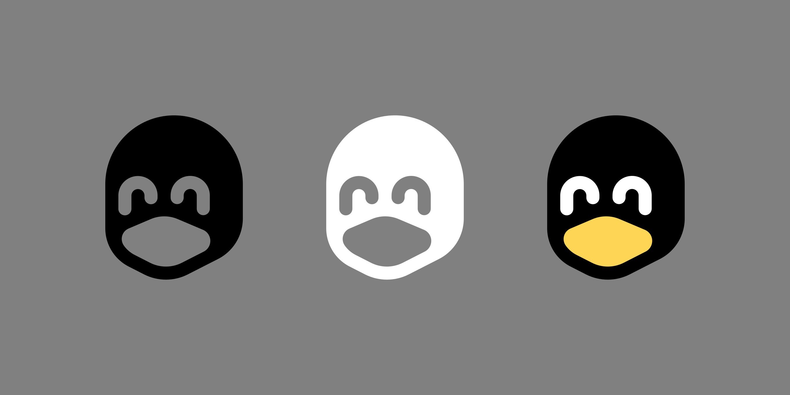
These are only meant to help for cases where the full tux is too detailed to display, see examples in the linked README. But the shape also works well for single fill cases, like in the keychain example. I wouldn't want these to be used when the full tux could be displayed in all its glory instead.
One issue I have is I do not know how to license these properly, I wouldn't want them to show up in a trademarked logo or anything, but I would still want them to be freely usable as tux icons anywhere. What do you think?
I have chosen the CC BY-SA 4.0 license, thank you for helping me!
You are viewing a single comment
The black one has open o_o eyes but the white one has closed ^_^ eyes
I can't find it, but I have seen a video where a designer talked about how you can't just invert your monochromatic logo to make it white-on-black. There's an effect that will make several aspects of the logo feel very differently, even though it's just inverted.
he won't stop me.. (e: /s)
You will live in fear that one day when you come home, you'll find him sitting in your chair, patiently waiting for his revenge.
xD
Yeah, there must be something subjective going on because they all look the same to me. They all look like closed happy eyes to me.
I think you’re absolutely right… perhaps something with the effect of lighter compared to the rest = open vs darker compared to the rest = closed.
I think it’s also magnified by the fact that we’re comparing to the full color one on the right which has the lighter color for (in my perception) open eyes.
Yeah I think the black part tricks your brain into thinking "those are pupils", and the eyes go from smiley shut ones to normal open ones.
Yeah exactly.