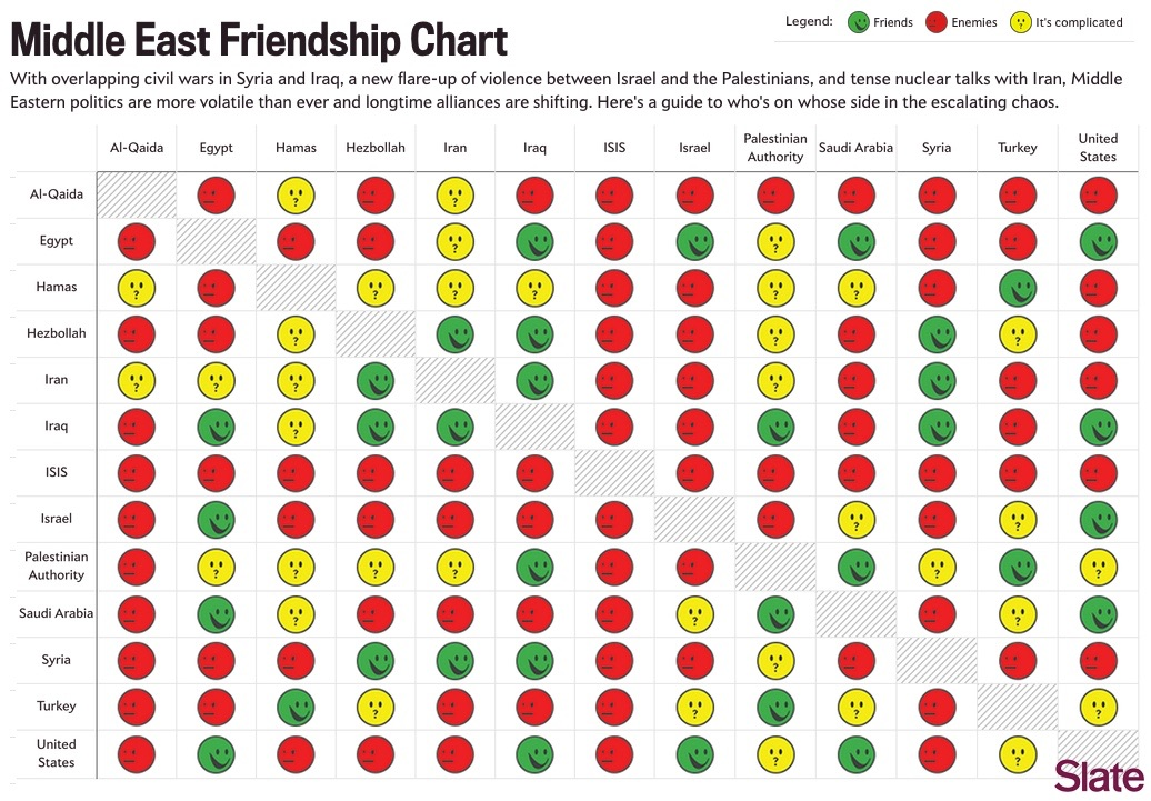
These type of charts annoy me because they have redundant information. They're symmetric along the diagonal.
Particularly when they don't have to be. These relationships are rarely symmetric.
Is there a better way to present the data with less redundancy?
Typically you'd just present it as the upper diagonal of the matrix.
Then you can't just scan a row and get the whole info about a country. Images are rectangular anyways
You can if you pick a column.
What i would do is put the name of each group in the gray box which is currently just where each group intersects with themselves. Then delete everything above that so it's just a triangle.
Why tho? It makes parsing at least somewhat harder and you don't save any space


These type of charts annoy me because they have redundant information. They're symmetric along the diagonal.
Particularly when they don't have to be. These relationships are rarely symmetric.
Is there a better way to present the data with less redundancy?
Typically you'd just present it as the upper diagonal of the matrix.
Then you can't just scan a row and get the whole info about a country. Images are rectangular anyways
You can if you pick a column. What i would do is put the name of each group in the gray box which is currently just where each group intersects with themselves. Then delete everything above that so it's just a triangle.
Why tho? It makes parsing at least somewhat harder and you don't save any space