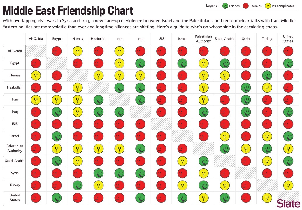
These type of charts annoy me because they have redundant information. They're symmetric along the diagonal.
Particularly when they don't have to be. These relationships are rarely symmetric.
Is there a better way to present the data with less redundancy?
Typically you'd just present it as the upper diagonal of the matrix.
Then you can't just scan a row and get the whole info about a country. Images are rectangular anyways
You can if you pick a column.
What i would do is put the name of each group in the gray box which is currently just where each group intersects with themselves. Then delete everything above that so it's just a triangle.
Why tho? It makes parsing at least somewhat harder and you don't save any space
ISIS over here beefing with everyone, ride or die for the caliphate inshallah
The feeling is mutual.
US and Iraq get along? Is that because we blew all the people there that didn't like us to oblivion?
The u.s. also still holds all their foreign currency reserves, so they're kinda forced to be friendly if they want to keep their economy a float.
probably from 10 years ok
Isis doesn't have any friends to play with
ISIS is the kid that takes their toys and goes home.
Looking like a goddam pokemon type match-up chart
I'm not much of a Pokemon player, but I saw the chart in Arceus the other day and I was like "Jesus fuck. It used to just be Rock Paper Scissors. Now you need a freaking spreadsheet!"
It was never rock paper scissors. The three starters are an analogue of rock, paper, scissors. But the other types have much more complicated relationships even in the first release of pokemon in the 90s.
They've added 3 (or 4) types in the past 28(?) years. The chart didn't get that much more complex... That's nothing for a such an old game...
ISIS doing sick combos
ISIS believes (incorrectly) you can force the Islamic State, much the way Christian Nationalists think you can purge the nonbelievers. And then the heretics. And then the sinners. And then the secret sinners. And then the insufficiently pious.
The path to a global ideological state is to feed the poor and the radicals. A few years of good living and no-one wants to fight anymore.
Haha, it looks like somebody's just mashing light punch
A better ordering of the columns would make this easier to read..
I kinda expect some asymmetry somewhere. Like Jordan is a big fan of Qatar, but Qatar totally wants to destroy Jordan.
i remember seeing this exact chart 10-ish years ago. how accurate is this info now?
Partly accurate.
Afaik for Turkey all red items should be yellow except AlQaeda and ISIS.
im noticing a strong negative correlation, roughly where x=-y
are the U.S. and Saudi Arabia still friends? I have a cute ex there and I worry about him a lot
I'm sure he's doing fine in the US, though the news likes to imply they're headed for a second civil war almost daily.
Nono, other way around. I'm in the US, he's in Saudi. Sorry for the confusion!
Wouldn't a graph be easier to read?
Since when is the US in the middle east? Have these people ever seen a map?


These type of charts annoy me because they have redundant information. They're symmetric along the diagonal.
Particularly when they don't have to be. These relationships are rarely symmetric.
Is there a better way to present the data with less redundancy?
Typically you'd just present it as the upper diagonal of the matrix.
Then you can't just scan a row and get the whole info about a country. Images are rectangular anyways
You can if you pick a column. What i would do is put the name of each group in the gray box which is currently just where each group intersects with themselves. Then delete everything above that so it's just a triangle.
Why tho? It makes parsing at least somewhat harder and you don't save any space
ISIS over here beefing with everyone, ride or die for the caliphate inshallah
The feeling is mutual.
US and Iraq get along? Is that because we blew all the people there that didn't like us to oblivion?
The u.s. also still holds all their foreign currency reserves, so they're kinda forced to be friendly if they want to keep their economy a float.
probably from 10 years ok
Isis doesn't have any friends to play with
ISIS is the kid that takes their toys and goes home.
Looking like a goddam pokemon type match-up chart
I'm not much of a Pokemon player, but I saw the chart in Arceus the other day and I was like "Jesus fuck. It used to just be Rock Paper Scissors. Now you need a freaking spreadsheet!"
It was never rock paper scissors. The three starters are an analogue of rock, paper, scissors. But the other types have much more complicated relationships even in the first release of pokemon in the 90s.
They've added 3 (or 4) types in the past 28(?) years. The chart didn't get that much more complex... That's nothing for a such an old game...
ISIS doing sick combos
ISIS believes (incorrectly) you can force the Islamic State, much the way Christian Nationalists think you can purge the nonbelievers. And then the heretics. And then the sinners. And then the secret sinners. And then the insufficiently pious.
The path to a global ideological state is to feed the poor and the radicals. A few years of good living and no-one wants to fight anymore.
Haha, it looks like somebody's just mashing light punch
A better ordering of the columns would make this easier to read..
I kinda expect some asymmetry somewhere. Like Jordan is a big fan of Qatar, but Qatar totally wants to destroy Jordan.
i remember seeing this exact chart 10-ish years ago. how accurate is this info now?
Partly accurate.
Afaik for Turkey all red items should be yellow except AlQaeda and ISIS.
im noticing a strong negative correlation, roughly where x=-y
are the U.S. and Saudi Arabia still friends? I have a cute ex there and I worry about him a lot
I'm sure he's doing fine in the US, though the news likes to imply they're headed for a second civil war almost daily.
Nono, other way around. I'm in the US, he's in Saudi. Sorry for the confusion!
Wouldn't a graph be easier to read?
Since when is the US in the middle east? Have these people ever seen a map?