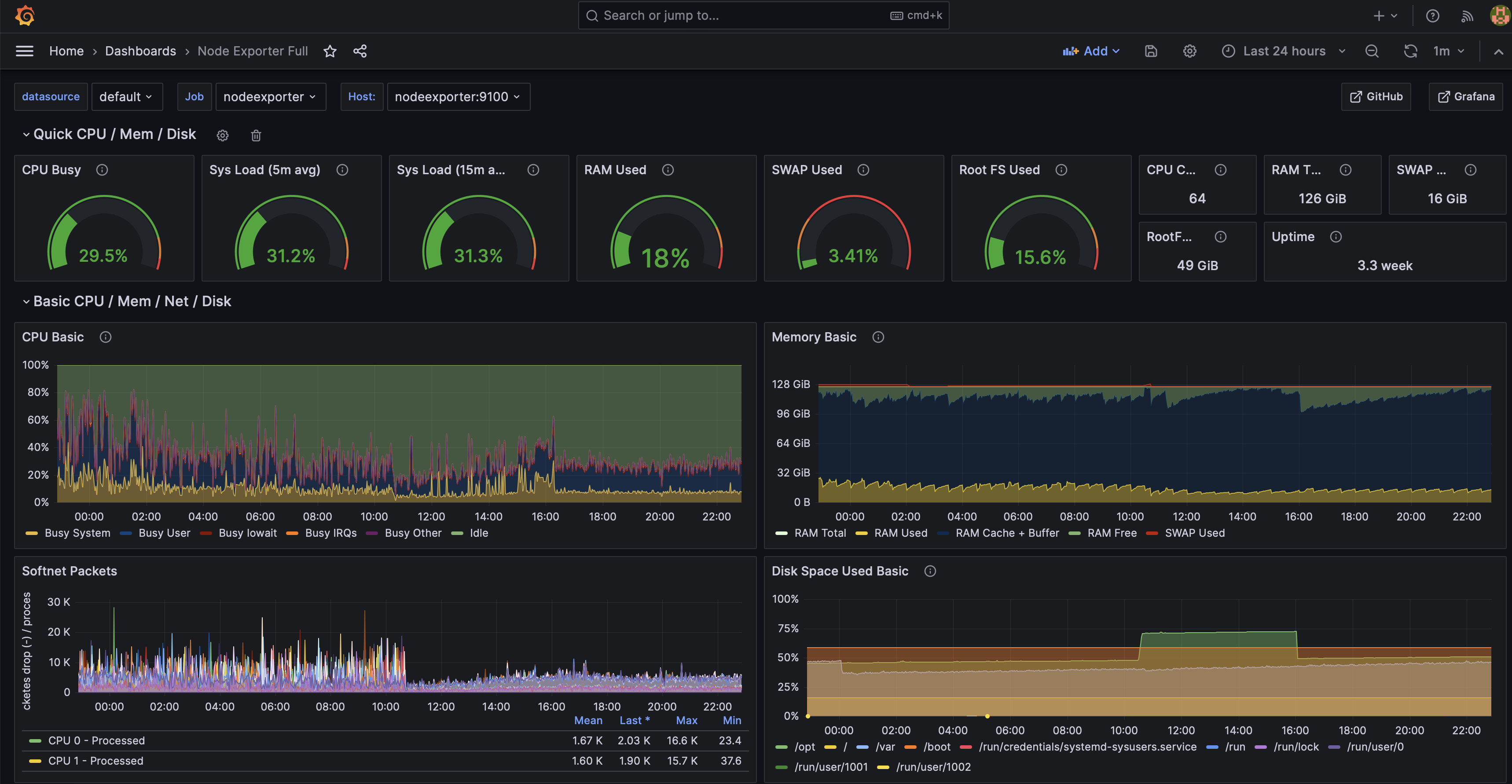
I hate that radial graphs are so popular with *Grafana dashboards. Radial/pie charts are terrible representations for humans to interpret. I tend to try and convert them either to a stat with the line/time display or a bar chart. Humans are better judging linear relationships than radial.
Who says I'm human?
Or are you dancer?
Killers ❤️
Radial graphs are a bit of a meme where I work as one of the C-suite managers despises them for precisely that reason.