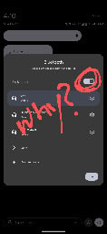
We heard you like toggles so we put a toggle in your toggle.


This toggle is annoying because what was once 1 press to turn on BT is now 2. It gets me every day.
You are viewing a single comment


This toggle is annoying because what was once 1 press to turn on BT is now 2. It gets me every day.
The fuck.... now i understand why the hell sometimes it opens me that annoying window ... It works the same on miui
Same on OneUI, it's been part of the UX language for a while.
But the wifi button still pisses me off. I want my separate LTE data toggle back.
I actually have separate buttons for WiFi and data but they were buried in the 'edit' list
Not in stock Android 14 / AOSP
I thought Lineage OS was pretty close to AOSP, interesting to discover the things which have been added
Yes the buttons and the "long press power button on display off for flashlight" both small but soo useful things
Gad damn, I use that all the time!
Yup, an issue on the GrapheneOS issue tracker was closed, to implement this feature. Maybe giving it another try might help? Its damn useful and smart, as this has no function
Lineage OS based on Android 11. Pressing the icon toggles Bluetooth. Pressing the text opens popup. It works the same way also for wi-fi, mobile data and DND.
This I can agree with
The way it works right now on my phone is you tap it to turn it on and off and then you long hold to open the setting.
I'm going to be peeved if that goes away in favor of OPs process...
Yeah, long-pressing to open the menu makes intuitive sense regardless of whether you open the menu more than toggle.
That's how my Samsung works too