[Awesome WM] My First Customisation


I tried AwesomeWM two days ago, and after two days of hard work understanding the API reference, I came up with this. More screenshots are below.
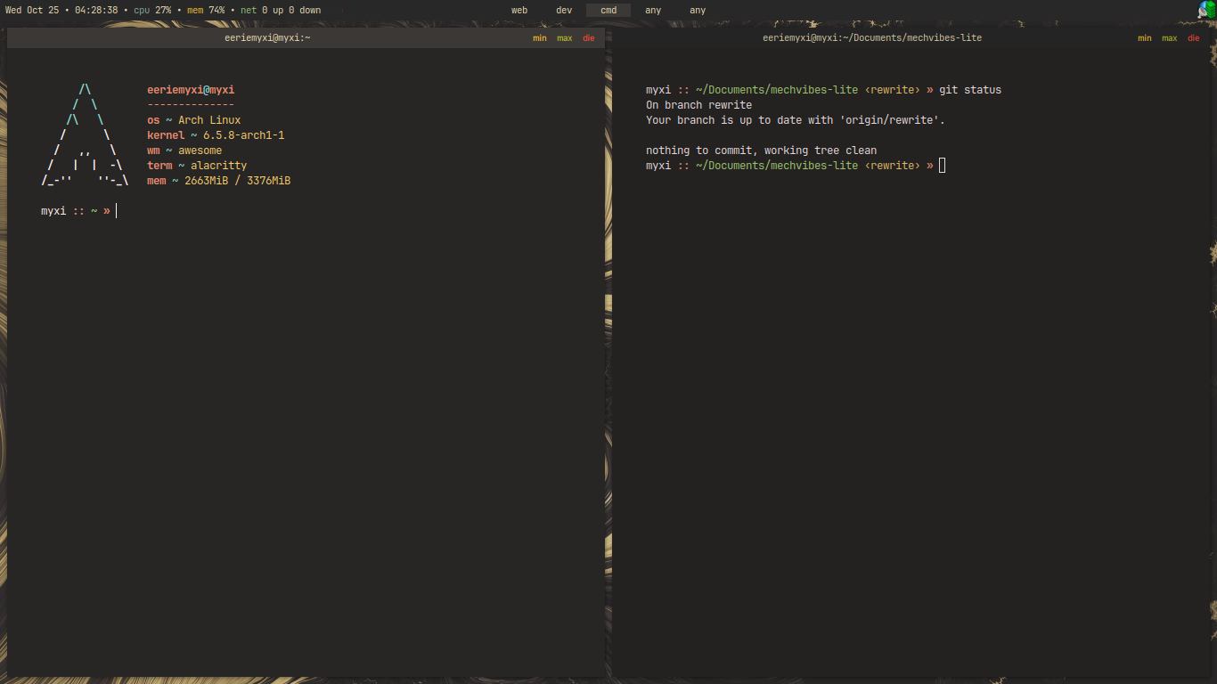

I tried AwesomeWM two days ago, and after two days of hard work understanding the API reference, I came up with this. More screenshots are below.
I wish I could upvote you twice; once for the picture and once for choosing to use “customization”.
I used to be in love with Awesome but I think it's been more than 10 years since I used it last. I remember the software being wonderful and the people in the people in the community being stereotypical, smug, "rtfm" types.. That was more frustrating than anything else about Awesome.
I experienced this too. That's why I stopped asking them anything after my first query (why my keybindings were not working when defined in another file) and relied on guess work. I also found the community kind of dead, so you don't actually get the answers quicker than the guess work will get you there.
Nice! Color schemes?
I believe this is gruvbox
You are correct.
looks stunning
DIE
Everyone that's ever used AwesomeWM felt that. I felt that too.
I had to look through the source code of their widgets (like
wibox.widget.textclock,awful.titlebar.widget.maximizedbutton) they use in their default config file to have a grasp of what's happening. Looking through others' dotfiles was more pain because it's not supposed to be looked upon by the beginners, so they cram all they know in a few lines and leave you guessing.Yeah. I found it quite painful, having to go through and find all I needed. The hardest part for me was underlines. I wanted my focused workspace to be underlined. It was very difficult tp figure out and the solution is ultimately a hack, but it works.
What code font do you use ? Also please share your font rendering
I use JetBrains Mono font. I am not sure what you meant by font rendering, so if you're interested, you can check my dotfiles.
Question: do you like the text min/max/close buttons over colored circles or icons?
Yes, I like text more than visual icons. More proof is given by the fact that I used words like
cpu,mem,netover the thousands of icons I could've used instead, considering that the font I am using is a Nerd Font patched one.I loved the color pallet 💝
I love it too. It's pretty much Gruvbox.