I spent 10 minutes looking at this trying to figure out what was wrong with the rendering of the characters, the alignment, the graphic… I just couldn’t figure out what the hell OP was complaining about.
I had to go out and have a smoke, smoke a bowl, and come back and see the image all magnified on the screen from far away before I noticed: oh— one’s black.
lmao
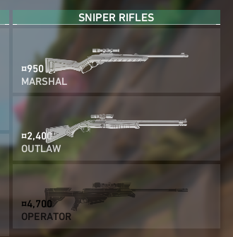
The zero touches the butt of the gun
lol, I’m going to start by saying: I’m a little drunk, so.. I don’t know if you’re joking, but that was funny.
now, if you’re serious, and that is a rendering error (I’m a ux designer by trade), then, yeah, text like that shouldn’t overlap graphics of the same color. it presents readability issues, especially for ADA/disability during gameplay metrics if certain gameplay devices make concessions for those with visual impairments. The spacing should be changed, or the text color should be changed (to yellow, perhaps?)
But I don’t know what this interface is supposed to look like, so… does anyone have a screenshot of this screen rendered correctly, ya know, for reference?
gotcha. thanks!
Wow - selected is just as bad. How about a less bright background, a border or inverting the gun and text?
I thought it was a shotgun with sniper rifles
In the US, virtually all butts of guns are virtually always touched by absolute zeroes. 💡

I spent 10 minutes looking at this trying to figure out what was wrong with the rendering of the characters, the alignment, the graphic… I just couldn’t figure out what the hell OP was complaining about.
I had to go out and have a smoke, smoke a bowl, and come back and see the image all magnified on the screen from far away before I noticed: oh— one’s black.
lmao
The zero touches the butt of the gun
lol, I’m going to start by saying: I’m a little drunk, so.. I don’t know if you’re joking, but that was funny.
now, if you’re serious, and that is a rendering error (I’m a ux designer by trade), then, yeah, text like that shouldn’t overlap graphics of the same color. it presents readability issues, especially for ADA/disability during gameplay metrics if certain gameplay devices make concessions for those with visual impairments. The spacing should be changed, or the text color should be changed (to yellow, perhaps?)
But I don’t know what this interface is supposed to look like, so… does anyone have a screenshot of this screen rendered correctly, ya know, for reference?
gotcha. thanks!
Wow - selected is just as bad. How about a less bright background, a border or inverting the gun and text?
I thought it was a shotgun with sniper rifles
In the US, virtually all butts of guns are virtually always touched by absolute zeroes. 💡
And the text overlays the image. Slow day, huh?
They could just align the text bottom right, where there's less gun poking into the area