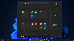
Windows 11 is getting a new start menu. EDIT: this replaces the "all apps" page by default, not the home screem


More info about it here: https://www.ghacks.net/2024/08/13/windows-11-start-menu-is-getting-a-new-layout-to-organize-your-apps/
I love how microsoft never learns their lessons.
You are viewing a single comment
This isn't the first time Microsoft has done this, I remember this being a huge gripe for me with Windows 8/8.1
Hey that was when they thought it was also a smart idea to force that shit tablet view on users...
And they did it on Windows Server too, which made even less sense.
Don't your servers run on phones?
You mean you didn't use touch screen monitors on your servers?
I didn't mind it actually. Like I don't mind the GNOME overview or whatever the thing that comes up when you press Meta is called
i love the workflow of gnome, it takes time to get used to but its really nice
Gnome is still a bit quirky to me and I've been running it on my latest install. I still don't get their idea of by default, without extensions, how I'm supposed to use software that requires a tray icon to use.
I guess the difference is that the Gnome overview has been thought out amazingly, has a fantastic search function that actually works, and Gnome takes heavy advantage of their superb implementation of workspaces (virtual desktops).
Gnome doesn't really feel designed for tablets, it feels designed for everything. Hot corners, large click targets, and having good keyboard shortcuts makes it feel good on a desktop, amazing trackpad gestures make it feel at home on a laptop.
Win8 had options scattered everywhere, a search that was just starting to turn bad, and initially did silly things like only let you use one app at a time, no matter your screen size. It was forcing a tablet UX that just felt wrong on a PC.
I think Microsoft were hoping thin and light foldable/tablet devices (that were all the rage at that point) were a good way to sell more windows licenses (thin and lights are weaker hardware so will likely need updated more to keep up with performance demands), hinges are weak points so hardware will be replaced more, all meaning more licenses sold. They were trying to force Windows down this path, IMO. When that failed, they turned to much greater data harvesting, ads, etc.
Come on, it's totally intuitive! Just put your mouse in the top right corner, off the screen, and swipe down to make the "charms" bar slide out from the side.
Wait, what?
Strangly this UI always reminds me of the hospital scene from Idiocracy... Click the icon for where it hurts
With Windows 8, they all hurt.
Uh THIS one goes in your mouth
… wait, no.
Yeach the ui sucked, kinda sucked. I actually kinda liked it on 8.1 . But the one thing windows 8 did right was efficiency. I still remember my update from windows 8 to 10 when witcher 3 on my laptop went from barerly playbale to unplaybale. Sad story.
I found the same and I daily drove Windows 8.1 with OpenShell to the very end of support.