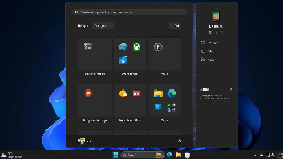
Windows 11 is getting a new start menu. EDIT: this replaces the "all apps" page by default, not the home screem


More info about it here: https://www.ghacks.net/2024/08/13/windows-11-start-menu-is-getting-a-new-layout-to-organize-your-apps/
I love how microsoft never learns their lessons.
You are viewing a single comment
What the fuck is the point of the start button in the middle? Like, did they forget why the space to the right of it even exists.
Yeah, I moved that back the minute I upgraded to 11. It's much better in the bottom left.
That change was absolutely idiotic. It reminds me of that time Apple changed the scroll direction. Who ever asked for any of this?
I've used StartAllBack to get the start menu exactly how I want it.
I dread having to upgrade at work, I set the group policy to deny the upgrade for the moment. They won't allow me to use ASB.
Aw that sucks. My biggest issue is the thickness of the new bar. Wastes so much space
Oh god yes, you can modify it in the registry (or you used to be able to) but then the date/time gets fucked up. I hate W11 so much
I like w11, i just hate the taskbar
I couldn't get past the Taskbar long enough to not hate it unfortunately. I also missed quicklinks, which I use a lot.
What're quick links?
Sorry, it's Quicklaunch.
https://static1.howtogeekimages.com/wordpress/wp-content/uploads/2017/02/02_show_desktop_icon_on_quick_launch_bar.png
I have my most used applications there so I never have to hit the start button.
Doesn't pinned apps on the taskbar work for that same use case? I've just used that instead since Windows 7
Similarly but not quite. I also have stuff pinned, but the quick launch also allows you to have a menu that you can open with a list of apps too. The icons are also much closer together, so in the space of 5 pinned icons, I can have 11 quick launch icons.
Fair enough
i keep forgetting it's in the middle by default. first thing i did was change the setting to put it back on the left corner.
well they essentially copied the Mac dock for no reason. The icons will still go to the right of start but overall the elements will be centered.
What goes to the left of the center start button?
That's the septic tank to store the waste from enshitification.
In this case the person you were responding to was right. It is where they put their news and weather widget. Which only exists to push people onto Bing. It is annoying, and by default pops up on rollover, not click, so it is trivially easy to accidentally pull up, pumping those Bing engagement numbers.
I don't see how centering it changes that. They could just as easily leave the start menu left aligned and put the widgets button next to it
Makes sense on ultrawides.
Also, a start menu that opens in the centre is technically the best. It's in the most prominent part of the screen, and your mouse typically isn't far from there.
The start button is harder to hit than simply flinging it into the corner though, definitely.
If you're the kind of person who opens the start menu with the Windows key, a centre start menu is only an upgrade IMO.
In which case, the question becomes: what percentage of users are actually using ultrawides? If it isn't >50%, then the default should be the setting most appropriate to non-ultrawides. Unless you're going to autodetect screen resolution and set the button's location appropriately.
This is not rocket science, but Windows has been blowing it for quite some time now.
Never thought about ultrawide screens, that makes sense. Other than that I see no improvement whatsoever. Corner space is way easier to hit with a mouse, but even when using keyboard shortcuts having it in the middle is just an additional adjustment from what it used to be.
An OS should get out of my way and let me do what I do. Changing design language forces me to relearn what I had already had a flow for. In other words it's utterly useless.
And I just know I'm gonna hate that automatic categorisation of apps, just as I hate web searches from start menu. Alphabetical order is predictable, but this I'd have to relearn.
How? It's closer to where your mouse will be, and to where your eyes naturally gravitate.
Yeah. Windows moved from that path a long time ago.
It's an easier click target when it's in the corner. Moving cursor from the middle to the corner is negligible for me since I can reach the whole screen with relatively minor mouse movement.
In the end it's a muscle memory thing for me. Having the button in the middle just means I have to look for it in a different location than I've used to over the years.
Yeah that's why I said corner is superior if you open it with a mouse, and centre is superior for if you do it with your keyboard.
I wouldn't consider it superior, just different, in case of a keyboard shortcut.
It’s actually ideal with an ultra wide I have come to realise.
I actually prefer it in the middle, it's easier to get to.
But it changes position depending on the amount of apps open
I don't have enough apps open at any given time for that to be a noticeable inconvenience ¯_(ツ)_/¯
Weird, but I'm glad it works for you.
I actually use it like that. I dont really see the reason pepole hate it so much. Geniuenly a better place for it (mind you im only talking about placement. The design itself is something else ). Since generaly if you use start menu you focus on it to launch something so it might as well be in tge middle of your screen.
I guess that's fair, but then keep the button on the left.