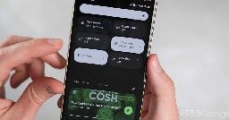
What the Android 16 Quick Settings redesign might look like


9to5google.com
cross-posted from: https://lemmy.world/post/19456945
Google is working on a redesign of Quick Settings that might launch with Android 16.


cross-posted from: https://lemmy.world/post/19456945
Google is working on a redesign of Quick Settings that might launch with Android 16.
I probably change the brightness setting the most. Why is it all the way at the top of the settings, the furthest out of reach it could be?
Wow, first time I feel strongly about a quick settings update. It looks awful, taking the worst parts of the Android 12+ redesign and combining them with the worst ideas from the older design, like unlabeled icons.
It looks like there are unlabeled icons in the expanded state? Wtf? If I'm expanding the quick settings, that means I'm fishing for the less used settings, so there's no way I'm going to remember that for example the weird circle with a small segment cut out means "Data saver". It will just be a mystery icon that does some mystery action - that has nothing to do in a modern OS.
It looks like this design is heavily sacrificing usability for people who don't spend hours every day mucking around with quick settings in order to please some hypothetical user who feels more slowed down by swiping over one or two screens than by having to find the one setting they currently need in a big matrix of poorly designed icons.
Edit: also it looks like the home screen is visible under the quick settings - I'm not a big fan of that, I really like the current design where the notifications are pretty much their own separate screen without distracting app content, but that's just my subjective taste. Unlabeled icons are objectively bad.
One thing that pisses me off with modern UI design is the lack of labels beside icons.
I want my wifi toggle back dammit.
Edit: I'd also love not to be harassed when I turn off GPS google data addict freaks.
Better Internet Tiles
F-Droid
Play store
Requires either Shizuku or root, but works well enough that I forgot it wasn't the default until you reminded me.
Is shizuku a big vulnerability?
Only if you don't trust what's using it, but both it and the app I linked are open source, so I personally consider the risk to be minimal.
It also has a permission system, you have to allow each app that uses it. (Just like root managers such as Magisk)
My brother in Christ and all his disciples, can we just go back to the quick settings from Android 11 that is accessible when holding and using the phone with one hand and has more than 4 options? Or, and I know this sounds CRAZY, give users a choice? If you are going to harp on Apple about locking their ecosystem down, then when you introduce new methods of navigation keep some way of going back to the old way.
I can even do this in the shit box that is Windows 11. I finally had to use and interact with it for the first time this week, and with the installation of two programs I was able to get the start menu, taskbar, and right click menu back to the way I want. Even installing Lineage OS on my phone can't get me back to the old quick settings tiles as far as I am aware of.
Nope. They're going to shove those graphic design skills down your throat whether you like it or not. Remember though it's not because corporations hate you, it's because they love money. I'm not sure how that translates here but I'm sure it makes somebody money somehow so it's suffering for us!
So more like the old way which was more functional. Good. Also while they're at it if they could bring back the single tap toggle for Bluetooth but long press to connect devices, I'd like that. This way sucks.
While speaking on Bluetooth toggle, I find it very annoying that in order to toggle it, you have to unlock the phone. I.e. when phone locked, you click the button, then get prompted for unlocking, then the phone is unlocked and the Bluetooth toggled. In such case, the phone should stay locked after the prompt and only toggle the functionality
This is a good point. I used to use it all the time without unlocking my phone. Now it's just annoying.
Could it be a security measure, to stop others from enabling it on your locked device, since enabled bluetooth might be a weakness security-wise?
All I was saying it should keep your phone locked after the BT was toggled
Yeah, I just re-read your comment. I see now that mine didn't really answer to what you actually said - sorry for that.
I agree with you, though. Unlocking the screen is useless when the user only wanted to quickly toggle a mode of connectivity or such.
Gosh that bluetooth button annoys me still. It was working fine and they changed it... why?
The same reason they always do. Because reasons.
I miss how customizable old android was, then google comes in hot with material-u all like "we brought you customization". No, no you did not.