Anything beyond ncurses is a crutch for the weak and corrupting the youth.
Upon changing ticket system at work, one of the graybeards asked about apis and cli access because "real men don't click"
Then I must be among the manliest of men. :)
I learned all the different ways to use the keyboard in Windows and never looked back. The best of both worlds, although relearning everything now that I've switched to Linux is proving a challenge. I'm starting to think that the Linux GUIs don't have true keyboard accessibility.
cli gang
Where my turbo vision peeps at?
ncurses is bloat
Sorry, I like my curses restricted and old skool
Every time I take a look at collections of user created themes for anything, I am reminded why design is a profession.
Not trying to shame anyone, I've been an enjoyer of custom themes ever since I started using Linux, but you need to have at the very least a little contrast in your theme. That's kinda where this conversation begins :D
User themes having poor contrast and inconsistencies is why I stick to stock themes, made by UX/UI designers who work directly with the developers.
I really don't care about my OS UI since I'm barely actually using it, especially after a few minutes setting up one-click actions. Less than 1% of my time and effort on the computer.
Applications, on the other hand, is where I live and FUCKING HELL!!!
Look, if everyone just decided on a style and everyone went with it within a system I'd be okay with that. It's not great but at least it wouldn't be jarring.
But having to live by the whim of 50 different app designers is disgusting. I just want to have a good time, not learn 50 different interfaces.
Though my thoughts on it would also stifle new ideas. So that's bad.
It's like getting into a car you haven't driven before and you hit the wipers instead of the indicator ×1000. Or playing an FPS and E is now F, C is now Ctrl, X is Shift, and you tap+hold instead of tap. WHY?!?! You can remap, but suddenly there's conflicting keys for shit the tutorial hasn't even introduced to you yet, so you don't know what you can or can't get away with.
Some designer or dev has a personal opinion they think is better than everything else and now we all gotta live with it on the hopes that'll be the new standard. And there's so many of those arseholes and their DVORAK layouts and putting "Cancel" on the left and "Confirm" on the right of a dialogue popup. "I think it's better this way and the world will thank my big brain!"
YES I'm ranting, lol.
Wait confirm shouldn't be on the right? Like I am 99% sure most windows pop-up/modal Dialogs had ok on the left and cancel on the right but I am not entirely sure about Linux (also factorio has them left to right as in "go back and go forward" but I dunno if that is RTL dependent...)
No, no, they have to be on top of each other! Vertically aligned is the way of the future.
Try GNOME/GTK/adwaita apps. They are very consistent.
The GTK file chooser is probably the worst AND most inconsistent example of UX that I've ever seen
Contribute! Maybe you get a part of the 1 million Euro they got from the Sovereign Tech Fund.
Contribute with UX changes? To GNOME maintained software?
When it's an enhancement?
Enhancement? No, everything I have a problem with is explicitly intended behavior and GNOME devs are infamous for their everyone is stupid except me mentality
Does Gnome/GTK have an issue board where users vote on issues?
Free software development is not a democracy, and does not get driven by polls. Features and bugs are introduced by those who show up, within a community that works towards a shared goal.
I don't believe the intentional behavior is desirable and would like to see what other users think.
That's not how anything works.
That's a dick way of saying fuck off but I mean they do provide a free service. If they have a vision and don't want to deal with random people whining about it that's their prerogative. Same as yours to find that utterly insufferable.
They do provide a free service (GTK's file chooser), one that I find horrible and inconsistent (as per the thread) and intentionally so (on issues tangential to example that I found, although the proposed configurable behavior would be nice) - so I won't even entertain the thought of trying and contributing to it, as it has been suggested.
I don't know what is insufferable about that, other than the initial criticism...
It's your prerogative to find them insufferable is what I meant to say. Your criticism and opinions are fair enough.
I've got to work on the fact that seeing the word "insufferable" on social media makes me instinctively get defensive ._.
Pretty sure that money is for the people employed by the GNOME Foundation, they don't just pay every contributor.
No, they don't, but you could get regular contributor…
They are indeed very similar.
For me, desktop UI peaked at Windows 98.
Installing the 95/98 GTK theme by B00merang is one of the first things I do after a fresh installation of Linux Mint.
I do try other themes once in a blue moon. But I soon realise it is a downgrade and revert back. The last theme I tried was the Arc theme back in mid-late 2010s.
My biggest hurtle is why i can't see files as thumbnails when picking a file to open or save. It works for file library but the file picker won't show images as thumbnails. Only a list view with tiny thumbnails that sra too small to see the actual image
I never found that to be a problem. In fact, I find the thumbnails distracting. But I can see it being a problem for others.
The rare occasion I work with image files, I just open it to identify, if I haven’t already named it properly.
It also helps that most of my workflows are not image-heavy.
Yeah the thumbnail part becomes quite handy when picking pictures to edit or upload, especially when it is from a folder that mostly contains images
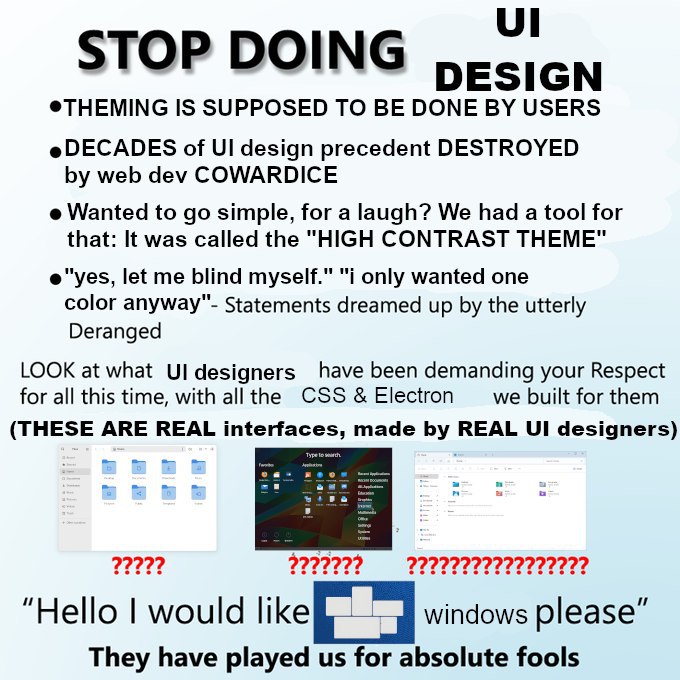
Does anyone know what the origin of this meme is? I started seeing it everywhere earlier this year out of nowhere


Anything beyond ncurses is a crutch for the weak and corrupting the youth.
Upon changing ticket system at work, one of the graybeards asked about apis and cli access because "real men don't click"
Then I must be among the manliest of men. :)
I learned all the different ways to use the keyboard in Windows and never looked back. The best of both worlds, although relearning everything now that I've switched to Linux is proving a challenge. I'm starting to think that the Linux GUIs don't have true keyboard accessibility.
cli gang
Where my turbo vision peeps at?
ncurses is bloat
Sorry, I like my curses restricted and old skool
Every time I take a look at collections of user created themes for anything, I am reminded why design is a profession.
Not trying to shame anyone, I've been an enjoyer of custom themes ever since I started using Linux, but you need to have at the very least a little contrast in your theme. That's kinda where this conversation begins :D
User themes having poor contrast and inconsistencies is why I stick to stock themes, made by UX/UI designers who work directly with the developers.
I really don't care about my OS UI since I'm barely actually using it, especially after a few minutes setting up one-click actions. Less than 1% of my time and effort on the computer.
Applications, on the other hand, is where I live and FUCKING HELL!!!
Look, if everyone just decided on a style and everyone went with it within a system I'd be okay with that. It's not great but at least it wouldn't be jarring.
But having to live by the whim of 50 different app designers is disgusting. I just want to have a good time, not learn 50 different interfaces.
Though my thoughts on it would also stifle new ideas. So that's bad.
It's like getting into a car you haven't driven before and you hit the wipers instead of the indicator ×1000. Or playing an FPS and E is now F, C is now Ctrl, X is Shift, and you tap+hold instead of tap. WHY?!?! You can remap, but suddenly there's conflicting keys for shit the tutorial hasn't even introduced to you yet, so you don't know what you can or can't get away with.
Some designer or dev has a personal opinion they think is better than everything else and now we all gotta live with it on the hopes that'll be the new standard. And there's so many of those arseholes and their DVORAK layouts and putting "Cancel" on the left and "Confirm" on the right of a dialogue popup. "I think it's better this way and the world will thank my big brain!"
YES I'm ranting, lol.
Wait confirm shouldn't be on the right? Like I am 99% sure most windows pop-up/modal Dialogs had ok on the left and cancel on the right but I am not entirely sure about Linux (also factorio has them left to right as in "go back and go forward" but I dunno if that is RTL dependent...)
No, no, they have to be on top of each other! Vertically aligned is the way of the future.
Try GNOME/GTK/adwaita apps. They are very consistent.
The GTK file chooser is probably the worst AND most inconsistent example of UX that I've ever seen
Contribute! Maybe you get a part of the 1 million Euro they got from the Sovereign Tech Fund.
Contribute with UX changes? To GNOME maintained software?
When it's an enhancement?
Enhancement? No, everything I have a problem with is explicitly intended behavior and GNOME devs are infamous for their everyone is stupid except me mentality
Edit, found a neat lil' example:
That's a dick way of saying fuck off but I mean they do provide a free service. If they have a vision and don't want to deal with random people whining about it that's their prerogative. Same as yours to find that utterly insufferable.
They do provide a free service (GTK's file chooser), one that I find horrible and inconsistent (as per the thread) and intentionally so (on issues tangential to example that I found, although the proposed configurable behavior would be nice) - so I won't even entertain the thought of trying and contributing to it, as it has been suggested.
I don't know what is insufferable about that, other than the initial criticism...
It's your prerogative to find them insufferable is what I meant to say. Your criticism and opinions are fair enough.
I've got to work on the fact that seeing the word "insufferable" on social media makes me instinctively get defensive ._.
Pretty sure that money is for the people employed by the GNOME Foundation, they don't just pay every contributor.
No, they don't, but you could get regular contributor…
They are indeed very similar.
For me, desktop UI peaked at Windows 98.
Installing the 95/98 GTK theme by B00merang is one of the first things I do after a fresh installation of Linux Mint.
I do try other themes once in a blue moon. But I soon realise it is a downgrade and revert back. The last theme I tried was the Arc theme back in mid-late 2010s.
My biggest hurtle is why i can't see files as thumbnails when picking a file to open or save. It works for file library but the file picker won't show images as thumbnails. Only a list view with tiny thumbnails that sra too small to see the actual image
I never found that to be a problem. In fact, I find the thumbnails distracting. But I can see it being a problem for others.
The rare occasion I work with image files, I just open it to identify, if I haven’t already named it properly.
It also helps that most of my workflows are not image-heavy.
Yeah the thumbnail part becomes quite handy when picking pictures to edit or upload, especially when it is from a folder that mostly contains images
Does anyone know what the origin of this meme is? I started seeing it everywhere earlier this year out of nowhere
stop doing science was the original
stop doing math