Introducing Connect for Lemmy


i.imgur.com
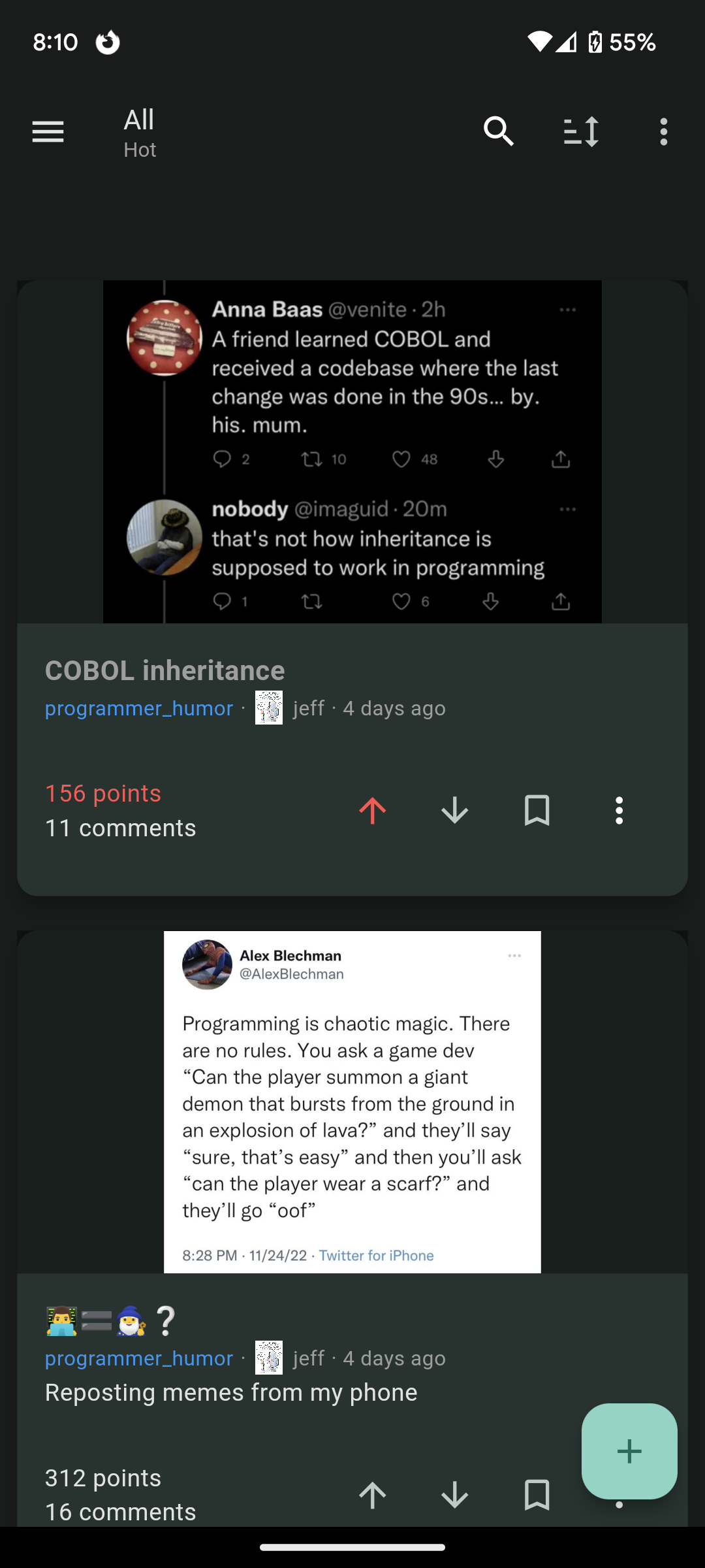
Hi lemmings, I switched over from Reddit 10 days ago now but I couldn't find a mobile client that I was happy with with an experience similar to the Reddit experience I was used to. So I decided to build my own and I hope you will like it as well!
Play store link: https://play.google.com/store/apps/details?id=com.kuroneko.lemmy_connect
Features:
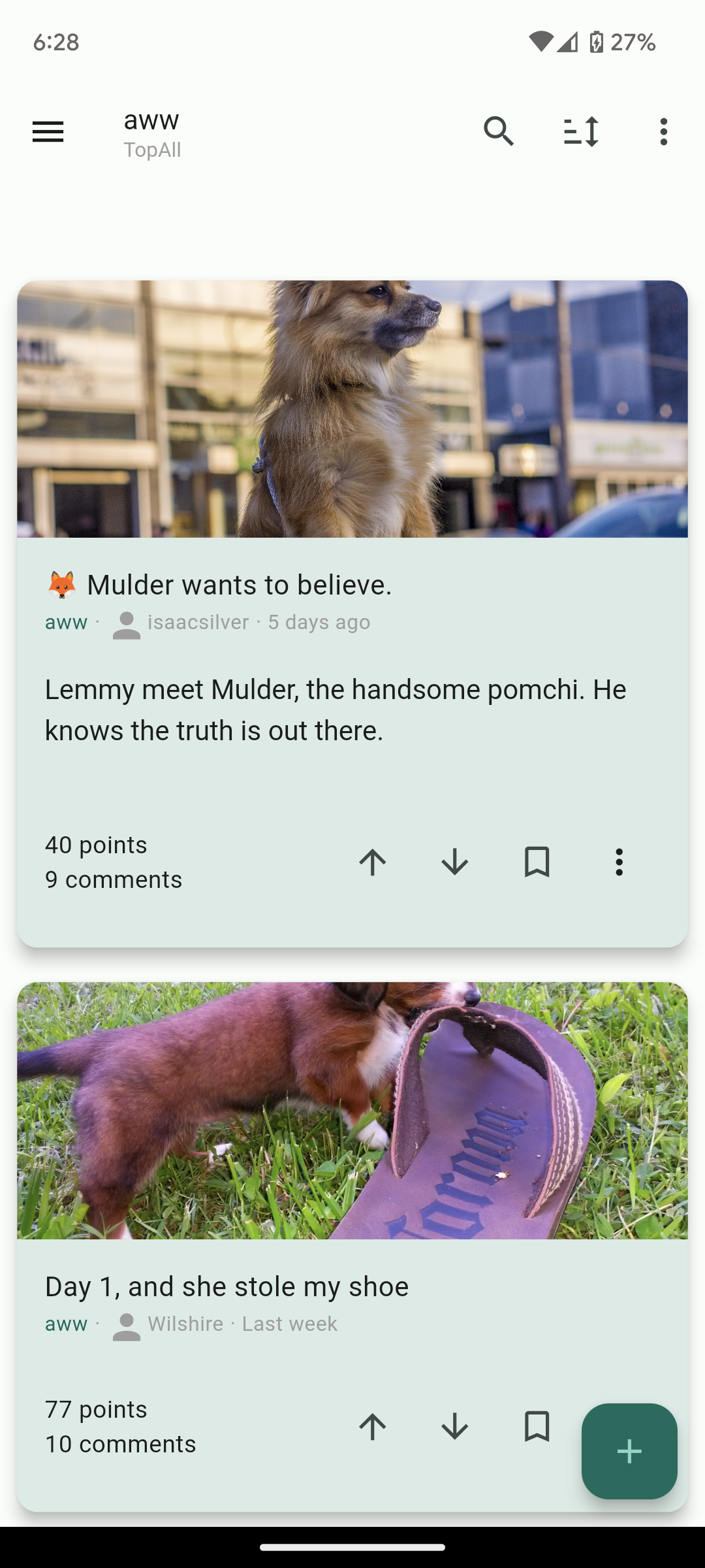
- Material U
- Dark and Light themes
- List view / Card view / Fullwidth view
- Filter lists for hiding posts
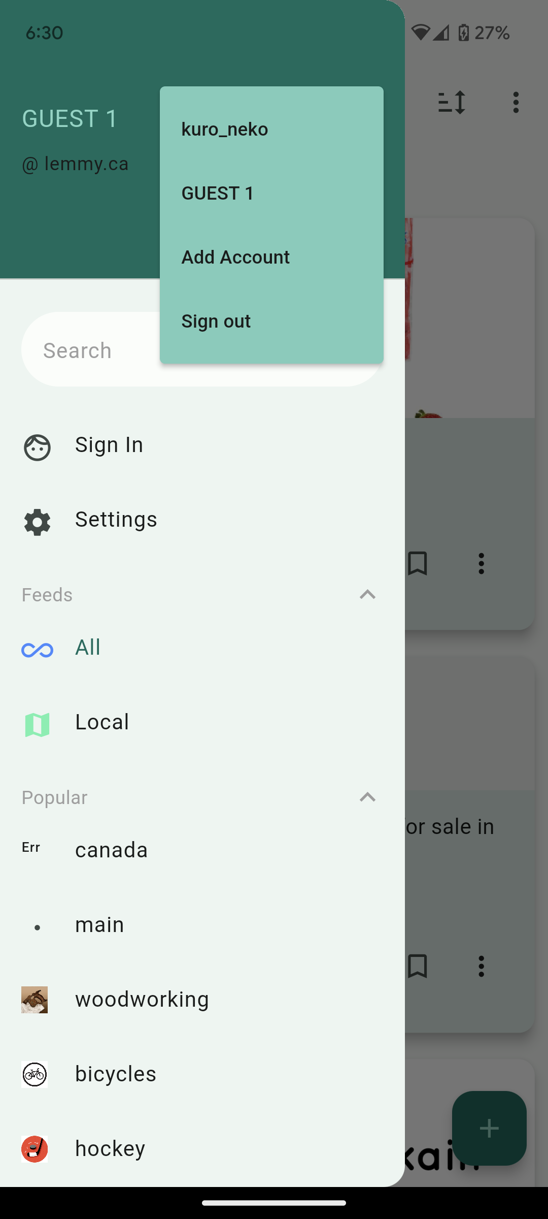
- Multiple accounts + switcher across multiple instances
- Guest accounts for viewing an instance without signup
- Search and community autofill
- Markdown support + attempt to navigate links correctly (/u/foo will open that user instead of browser kickout. Same for /c/, !, and @)
- Saving posts
- full sort types
- NSFW view options (hide, blur, show)
- copy text and url on all posts and comments
- add comments, replies, and new posts
- comment replies with line indicators
Here's other screenshots:


Future plans:
- Improving the inbox
- Swipe actions
- Multi-~~reddit ~~communities
Thank you for taking a look. I hope others who are migrating from Reddit like me will find the app useful and I'd love to know your thoughts!
Edit: Community for the app is here: https://lemmy.ca/c/lemmyconnect
The app looks great! Feels very fluid.
I have only three requests:
Hi, thanks for the feedback and I'm glad you're enjoying it! I've added a download button to media views. Open source is on the roadmap as well if there's enough interest.
Hey, black cat! From the screenshots, your app looks very promising. Would you consider making it FOSS, though? Just asking.
I am also looking forward to having access to the source code!
Thank God there's a filter setting 😭😭😭 sorely missed coming from infinity. First thing filtered? "reddit."
I would strongly recommend open-sourcing it! There are several FOSS apps already and it would be hard to compete against them without opening up =]
It's interesting. Needs some more formatting options imo. I liked how in boost for reddit the titles of posts were always at least as big as the preview of the body of the post. Just makes it look much cleaner imo. Could use a font size option. Could use some color options too eventually.
Also, it needs a "Subscribed" page. Default lemmy has this page that only shows you content from communities youre subscribed to. You should see about getting that feed on your app.
Overall though great work, it looks really promising thus far and I'm impressed with how quickly you've put this together.
'Subscribed' is called 'Frontpage' in the app, you can find it in the sidebar. Edit - oops, looks like kuro_neko beat me!
I'll take a look at how Boost for Reddit formats their titles, thanks! The 'Frontpage' once you're signed in should be equivalent to the Subscribed page.
Just adding a +1 for Boost's formatting!
Congrats for the release! I finally have alternative to Jerboa!
Some feedback if you don't mind:
These are very good suggestions! would also like for it to show the instance name of a post as well as the hold-to-show-image
That UI looks really clean. I love it. Is it open source? Not that i dont trust you but i try to not use any closed source apps anymore, i would appreciate it if you would share the link to the source code.
Nice job. But not available in my country (Germany). Looks really nice and familiar to reddit apps.
Hab sie gerade installiert. Probier's noch einmal ;)
Just added Germany to the list of countries! I think it will take Google an hour or so to update.
Thanks!! Would be nice if you can setup the f-droid app.
Nothing is showing up in my feed when signed in to lemmy.ml
Also, the Google password manager is trying to input the password into the instance text box when trying to sign in. Pixel 7 Pro.
Hi, this should now be fixed on the latest release (1.0.25). Thank you for your feedback!
Thanks man! It's working now. Super smooth for the most part. Upvotes/downvotes still take quite a while to register. An Amoled black would be awesome as would a Small Cards view.
Edit: Another suggestion is to add a way to jump to the next parent comment in a post. Looks like Jeroba just added this and I've been missing this feature from some of the reddit apps I used to use.
Hi, thanks for the feedback! I've added an AMOLED theme on the latest update (1.0.35). A small cards view is a good idea and I'll take a look at Jeroba's jump buttons. Cheers!
Thanks!
Might be because lemmy.ml is already on the new lemmy version.
Looks great from the screenshot!
The Google Play doesn't let me install it though and I can't find it via the Google Play app
Strange - I'll take a look! I'm testing on a Pixel 6 so I would think it would work.
I'm on pixel 6 and it doesn't work with logged in aurora store.
Edit: it works now!
Looks good and I was able to get it on pretty quickly. I was about to post this from the app but saw it's missing the web's markdown shortcuts and image upload option.
Also looking at this post the screenshots are cropped and I didn't see a straight forward way of looking at the whole image.
Thanks! I'll make a note to add markdown shortcuts and image upload to the next release. I should probably make those cropped images expand out on click.
I love the look and layout, but I can't get any threads to load. It just says "No posts"
I'll take a look! Do you have any filters applied? Is that across all instances?
No filters. Seems to be across all instances as far as I can tell. I'm on a Pixel 5a if that helps.
Lemmy.ml posts should now be loading on the most recent version (1.0.25). Thanks for the feedback!
Seconded. I logged in but the posts don't show up. Also only my subscriptions on my main instance are listed, not subscriptions from other instances.
This app looks really promising. Reminds me of Boost.
And you designed, developed, tested and published it in a less than 10 days? Your first android app? Really?
I switched over when the subreddits started going private. It's been a lot of long nights haha.
Not my first app :)
Oook.
There’s no reason to be so critical of OP for this … if anything, it’s impressive, or at least cute. Why you gotta be bringing Reddit negativity over here? )=
I love the app! I just wanted to give you some debug info. I can't log into a second account on my current andoid tablet or andoid 10 phone. The button to do so does nothing.
Hi! could you confirm you're on the latest version? it should say 1.0.31 under settings
That fixed it! You and your team are doing great work! It is appreciated!
That fixed it! You and your team are working very fast! Keep up the good work! It is appreciated!
That fixed it! You and your team are working very fast! Keep up the good work! It is appreciated!
Can you also host the APK or upload it on F-Droid?
Yeah I'll look into uploading the APK and add a reply here when it's ready.
Thanks, open source/foss is even better but thanks for at least looking at distributing it on other platforms!
I think I will open source it in the future but right now it's a very messy codebase coming from essentially a long coding binge.
A lot of people think that way but don't be afraid to post code because it isn't perfect. Lots of enterprise software looks awful. Also anyone who wants to be an ass about your code for such an early release isn't worth listening too. Most are just happy to help and can do pull requests to make your project better.
Agreed. I've seen some horrors in corporate code bases in my time. Created some, even. 😁
@kuro_neko This please, I want it on F-Droid too. Thank you, the client looks amazing.
I can't even be accepted to join Lemmy. I'm on Kbin right now.
Tbh, these platforms confuse me. The Kbin app is great though, so I guess I don't need to change.
Would like to know how to follow a group though.
Lemmy is not one thing, it's a way for different sites (called instances) to share content with each other.
What instances (i.e. domains) are you trying to create an account on? There have been some big bot waves in the last few days, but even without that every instance handles signup differently. Some are totally open, while others require manual review of some kind.
On Kbin, Lemmy groups are called "magazines," so all you have to do is go to the magazines list, search for what you want, and subscribe. You can even subscribe to magazines hosted on other servers from there.
Will you be making this open source?
Google Play say that is not available/compatible for my Xiaomy 12 Pro
Looks great but it says it's not available in my country (Brazil)
Just checked and was able to get it to install on my end, OP might have updated it in the meantime.
yeah it's fixed now, thanks anyway
Looks great! I'll also chime in that the Play Store website tells me it's not available for any of my devices, and the Play Store app says it's not available in my country (Chile).
looks good, been using jerboa for the past week. will check this one out too. cheers!
Looks very promising!
Got to love the explosion of both people and development around Lemmy!
Will this app be compatible with kbin.social accounts? I've tried to sign in and it's throwing a whole page of an error message.
I will look to see how possible it is, I think the APIs are different which is why it's throwing those errors.
Maybe bug: in list view, the width of post title and content seems to be limited to around 80% of my screen width.
Hi, just wanted to make sure you saw this but that issue is now fixed. Thanks again!
That's a bug! Thank you. I'd guess it's leaving the 20% space for an image thumbnail which doesn't exist. I'll fix this in the next release.
I signed into my dataterm.digital account but when I go on profile I see my feddit.de profile even though I didn't login with it.
Ah I must not be filtering the username with the instance so it's grabbing the first username match it sees. I'll fix this in the next release :)
Looks like Infinity! looks promising
Looks good. Now we just need a good iOS app
Tried it quickly and was not well surprised. I appreciate thr approach a lot! The app is nice looking but feels too chewy. Prefer the mobile browser.
A good start! but the card view's background color is too bright, and honestly a lot of the space feels wasted. I know it's a really fine line between wasting space and having everything be too dense, but I think you erred too far towards having everything spread out -- contents are indented too far, cards are too big outside the borders of content, the space between UI elements is too large, stuff like that. Also, I can't see subscribed communities outside of my instance, which almost immediately made the app unusable for me. But with all those criticisms in mind, this app is the closest one I've seen so far to being a lemmy app I actively want to use, it's just not quite there yet imo. Good luck with your development!!
Could you look into making the nav bar area transparent for gestures users? https://stackoverflow.com/questions/38161472/how-to-create-a-fully-transparent-navigation-bar
Hey, i like your app a lot! Jerboa doesnt work on my Motorola, so i installed your app. Looks very nice and works well as a first impression!
I just want to tell you good luck, we are all counting on you! :D
Thank you @Hovercat90@feddit.de! I'm glad you like it.
just downloaded the app. I really like it. please keep up the good work
Thank you! I'm glad you're enjoying it!
just a quick feedback, when being in the dark mode, the user switching remain in light mode. Also the node selection suggesting the possible nodes would be appreciated.
also, adding new accounts after the first one, doesn't seems to work.
I added my lemmy.world and it seemed to work.
anything else besides it, didn't work (tried, lemmy.ml, beehaw.org, etc.)
overall it's a good mvp, well done, need a little more work and i would appreciate if it was a FOSS to absolutely avoid situations in which an app become the unofficial-official app but then a sudden surge of egocentrism from an individual take it away.
Thank you! I'm glad you're enjoying it!
so far I'm really liking it. I would like alternating backgrounds on comments just to help separate them out a little.
I don't see the ability to edit my comments. I had to pull up the pwa to edit this one.
Hi, thanks for the feedback and I'm glad you're liking it! I've added some more spacing between comments on the latest release which should help to separate them. Please let me know what you think! Also added the ability to edit comments.
Yeah that's a lot better. I do think that you should make the names, points, and time a different color to make the poster information more prominent. Also would help it stand out a little better
Looks amazing! I'll try it out!
My keyboard constantly tries to switch to caps as I type in Connect. I am using Grammarly. It will flicker the upper case layout between each key press. It's unusable as it is.
Looks nice, but not available in my country.
Which country? I'll add it to the list of supported countries.
Suggestion: a setting that lets you set default sorting for comments would be great. So if I wanted post comments to be sorted by top by default, I could set that instead of needing to do it manually every time. Been looking everywhere for a Lemmy app that can do this, at least until the functionality is implemented into the site itself.
I'll add default comment sorting in the next release.
Downloaded and used for an hour or so. I'd like to see an option to change the font size. I like my stuff to be small so I can get more content on the screen. 1.6 posts is pretty bad for me. I also couldn't find a way to change my default homepage to "subscribed - new" but maybe I just didn't search hard enough. Either way, it's good to have some competition for Jerboa!
Edit: Found Frontpage. Might be worth changing this to Subscribed since that seems to be the Lemmy equivalent.
I'd also love to see an option to change the font size, but for the opposite reason - my eyes suck and I need bigger text! Lol. I love it so far either way!
Options for text sizes coming up in the next release :)
Fantastic! Thank you so very much! Also, damn you're quick, lol! I hope you're looking after yourself and taking care of yourself above all. It's important - you're important! <3
Thank you for the kind words, it's much appreciated!
Sad noises...
Australia.
Thanks for putting effort into this. By far the best reddit experience I have had is with relay for reddit.
You could also check it the feature requests for jerboa for ideas.
That's a good idea. Added Australia to the list!
Damn that looks awesome! Did you find any good docs on the API? I only found the lemmy-js-client, which is a library, though. Wanted to do some shenanigans with Python and Lemmy, but there doesn't seem to be too much documentation...
https://join-lemmy.org/api/classes/LemmyHttp.html
Wow, you are really fast! I've been using Jerboa and the PWA, but not super happy with either. Yours look great! Will use it more and feed back to you if that's okay.
One thing I found is that it doesn't show the number of new comments. I usually sort by NewComments, and I would expect to e.g. see "49 comments (14 new)" like Jerboa/PWA.
Thanks for the feedback! I'll add the new comment counter in the next release.
I may be wrong but, are you not showing all communities subscribed in the list, just the first page? I see 10 but im subbed to somewere closer to 50...
Yeah 10 I believe is the default limit on that API call. I'll increase that in the next release!
There is a maximum for the limit, you'll need to do actual pagination
actual pagination (and caching) added on the most recent version (1.0.25). Thank you for your feedback!
Have you considered creating a community for your app? Would make it a lot easier to follow development
Yeah I made one, it's empty right now but I'll post new releases + changelogs there. https://lemmy.ca/c/lemmyconnect
Awesome, thanks!