I find that to be true but it bothers me while srolling.
It's supposed to go away when scrolling down. It only pops up again if you're scrolling up, but then you'd be looking at the top of the screen anyway.
I know, that mechanic feels wrong to me. Can't really explain how.
I know what you mean. If you think about it it feels wrong, but when you're just using it it somehow doesn't.
Ah, the conflict of interests. It's okay, you can be a vers
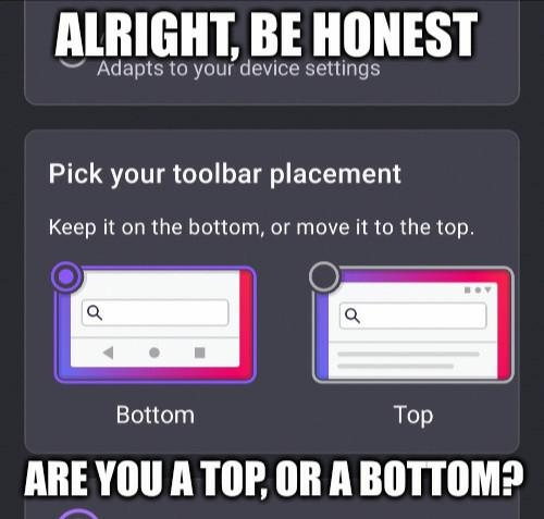
Top. My desktop has the adress bar at the top so I want my phone to be the same
think of all the extra miles your finger has traveled over the course of the year
Joke's on you: Those extra miles required extra energy so we're burning more calories a day than the bottoms.
Bottom. You guys hold your phone from the top?
I hold mine upside down
And you reach your fingers up to the top when typing?
I use my nose, tyvm
Ah easier that way
No but I can reach the top just fine, the bottom is just weird!
Phone: bottom
Tablet: top
So, uh, switch I guess?
Bottom for firefox, top for windows start bar. Switchhhh
idk why I do this also
I got my pc hooked up to a 4k tv like a normy, so it just works and looks better to have start up top but also having the browser bar up there is too much
Top. Always top. That's where all the tools I need for an application should be. Bottom area is for system tools.
It keeps things nicely separated, less risk of fat fingering something I don't want to hit.
yeah, let's just put all the important tools in the hardest to reach spot on the screen
top makes sense on desktop, but on phones bottom is just logical. took way too long to get to it already because of the exact notion you expressed
system tools
Not if your phone has hardware buttons
Bottom obv i am not a barbarian
My phone's to big. Bottom so my thumb can get to it.
Bottom is so much easier. Also yes bottom
Turns out I'm top, and you're bottom
So, uh...
Is Lemmy a match making site now?
Good point
It isn't
I'm honestly just lonely, slightly horny and very confused about who I am
Yeah, true. Best thing you can do is pretend, until you don't have to pretend anymore. One could say fake it, til you make it.
I like you guys, gals and nonbinary pals, you're all so understanding and nice here.
Let me just virtually hug you real quick, if you have nothing against it.
Definitely the top, otherwise I am misclicking the tooolbar.
But also, I am mostly a landscape smartphone user. Which is why I'd prefer 16:9 instead of whatever the hell this wide thing is. But with bezels. You can hold onto a bezel with thumb. Also a separate navigation button like I had on my Moto G5s Plus 🥰.
Landscape
Phone
You're a monster
Also permanently enabled Desktop mode on browser.
But I also increased minimum width in developer settings from default 395dp to 705dp. 600dp and above is considered a tablet by apps. Fits so much content on 1 screen.
Is it comfortable? From my experience landscape suffers from issues like the ui taking up a lot more screen space and the keyboard being hard to use.
That depends on what apps you use. But for example YouTube app in tablet mode looks nicer in landscape:
In phone mode you can only view comments/live chat in portrait mode.
In tablet mode, this is often the other way around. Some comparisons:
Google Photos
Phone mode:
Tablet mode:
YouTube
Phone mode:
Tablet mode:
Google Mail
Phone mode:
Tablet mode:
etc.
I mean, if your phone is a >6" monster, tablet mode makes sense... (I can't stand modern phones without replaceable batteries, bezels and a tactile Home button)
6.67", to be precise.
I think all phones above 6" are oversized. I would prefer a >5mm thick 5" 16:9 phone to any made today. I use a 5.4" phone and I'm still a Firefox bottom.
Top.
Bottom is just a workaround for poor mobile design.
Damn I just realized I'm a bottom and my gf is a top...
Well...
Bottom, phones got too big and I want to be able to reach it with one hand.
Even so, I still prefer top.
Top, although it takes more travel time for my thumb or index, depending on use case, it just feels more correct that way.
I put it on top which makes me a bottom
bottom : D
The bar belongs on the bottom
Can't use bottom because for some reason phone manufacturers decided to remove physical home keys and just have virtual ones. Whenever I try to click or swipe at the bottom of my screen I end up hitting it.
Oh no. Normally the onscreen buttons should not cover app content. What phone are you using?
Galaxy S10
Top
Bottom, IMO, but also if you are a top person... you are just wrong.
Google Chrome for Android mobile used to have a bottom option and they removed it. I prefer the bottoms because that is where we naturally type on phones and it is where your thumb naturally lays. Phones are getting bigger so you have less to reach around for with it on the bottom.
Gestures, so no toolbar on mobile
But
Where do you type in the URL
You don't. Just have every website in bookmarks.
Power bottom
Same. Toolbar is on the bottom but I use the phone upside down.
bottom :3
mobile firefox big succy though, tab behavior in is is fucking insane but no one seems to talk about it (╥﹏╥)
Top
Depends on my mood, so… vers?
Bottom
bottom, i dont have to reach as far. I've got a 20:9 aspect ratio or something ridiculous like that, it's a pain to reacj
Bottom placement didn’t help with your keyboard, apparently :P
ight spelling is difficult ok
I was a top, but then an update put it at the bottom and I haven't changed back yet.
According to this, top.
Don't use a toolbar
im a bottom in bed but a top on my phone uwu
Huh. I guess there is a situation where I'm definitely a top. Probably just one though 😜🤷♀️
Top for the address bar, bottom for ... uh...
Bottom because phones are way too big to comfortably reach the top at all.
I would only use top on a <4" phone. Currently using a 2017 Samsung J530F with a 5.4" 16:9 screen (significantly lower than most made today)
always top since that's what im used to
my first browser was android browser
Bottom, although I'm trying Kiwi at the moment
Bottom since the days of Windows Phone!
Bottom for life!
For mobile top because I keep accidentally pressing the home button with my hand and it's annoying.
And for PC on the top of course because anything else is illegal.

Bottom, it’s just easier
I find that to be true but it bothers me while srolling.
It's supposed to go away when scrolling down. It only pops up again if you're scrolling up, but then you'd be looking at the top of the screen anyway.
I know, that mechanic feels wrong to me. Can't really explain how.
I know what you mean. If you think about it it feels wrong, but when you're just using it it somehow doesn't.
Ah, the conflict of interests. It's okay, you can be a vers
Top. My desktop has the adress bar at the top so I want my phone to be the same
think of all the extra miles your finger has traveled over the course of the year
Joke's on you: Those extra miles required extra energy so we're burning more calories a day than the bottoms.
Bottom. You guys hold your phone from the top?
I hold mine upside down
And you reach your fingers up to the top when typing?
I use my nose, tyvm
Ah easier that way
No but I can reach the top just fine, the bottom is just weird!
Phone: bottom Tablet: top
So, uh, switch I guess?
Bottom for firefox, top for windows start bar. Switchhhh
idk why I do this also
I got my pc hooked up to a 4k tv like a normy, so it just works and looks better to have start up top but also having the browser bar up there is too much
Top. Always top. That's where all the tools I need for an application should be. Bottom area is for system tools.
It keeps things nicely separated, less risk of fat fingering something I don't want to hit.
yeah, let's just put all the important tools in the hardest to reach spot on the screen
top makes sense on desktop, but on phones bottom is just logical. took way too long to get to it already because of the exact notion you expressed
Not if your phone has hardware buttons
Bottom obv i am not a barbarian
My phone's to big. Bottom so my thumb can get to it.
Bottom is so much easier. Also yes bottom
Turns out I'm top, and you're bottom
So, uh...
Is Lemmy a match making site now?
Good point
It isn't
I'm honestly just lonely, slightly horny and very confused about who I am
Yeah, true. Best thing you can do is pretend, until you don't have to pretend anymore. One could say fake it, til you make it.
I like you guys, gals and nonbinary pals, you're all so understanding and nice here.
Let me just virtually hug you real quick, if you have nothing against it.
I'm fine with it. Come here ~
Bottom :3
Top: phone, desktop and in the bedroom.
what the actual fu
top bottom is just unnatural the browser bar belongs at the top and anyone who puts it at the bottom should be put down like the dog they are
insert image of man pushing boulder up a steep hill
Insert image of xkcd of someone who is wrong in the internet
I agree with the placement of the toolbar. You may wanna cut your coffee intake just a bit. You seem a bit hyper on the trigger
I don't drink coffee it's disgusting yucky bitter tea and hot chocolate are far nicer
Bottom only in bedroom
Bottom, it was the primary reason I switched to FF instead of chrome on my phone
True, and it has extensions too
Tehe.
Definitely the top, otherwise I am misclicking the tooolbar.
But also, I am mostly a landscape smartphone user. Which is why I'd prefer 16:9 instead of whatever the hell this wide thing is. But with bezels. You can hold onto a bezel with thumb. Also a separate navigation button like I had on my Moto G5s Plus 🥰.
You're a monster
Also permanently enabled Desktop mode on browser.
But I also increased minimum width in developer settings from default 395dp to 705dp. 600dp and above is considered a tablet by apps. Fits so much content on 1 screen.
Is it comfortable? From my experience landscape suffers from issues like the ui taking up a lot more screen space and the keyboard being hard to use.
That depends on what apps you use. But for example YouTube app in tablet mode looks nicer in landscape:
In phone mode you can only view comments/live chat in portrait mode.
In tablet mode, this is often the other way around. Some comparisons:
Google Photos
Phone mode:
Tablet mode:
YouTube
Phone mode:
Tablet mode:
Google Mail
Phone mode:
Tablet mode:
etc.
I mean, if your phone is a >6" monster, tablet mode makes sense... (I can't stand modern phones without replaceable batteries, bezels and a tactile Home button)
6.67", to be precise.
I think all phones above 6" are oversized. I would prefer a >5mm thick 5" 16:9 phone to any made today. I use a 5.4" phone and I'm still a Firefox bottom.
Top.
Bottom is just a workaround for poor mobile design.
Damn I just realized I'm a bottom and my gf is a top...
Well...
Bottom, phones got too big and I want to be able to reach it with one hand.
Even so, I still prefer top.
Top, although it takes more travel time for my thumb or index, depending on use case, it just feels more correct that way.
I put it on top which makes me a bottom
bottom : D
The bar belongs on the bottom
Can't use bottom because for some reason phone manufacturers decided to remove physical home keys and just have virtual ones. Whenever I try to click or swipe at the bottom of my screen I end up hitting it.
Oh no. Normally the onscreen buttons should not cover app content. What phone are you using?
Galaxy S10
Top
Bottom, IMO, but also if you are a top person... you are just wrong.
Google Chrome for Android mobile used to have a bottom option and they removed it. I prefer the bottoms because that is where we naturally type on phones and it is where your thumb naturally lays. Phones are getting bigger so you have less to reach around for with it on the bottom.
Gestures, so no toolbar on mobile
But Where do you type in the URL
You don't. Just have every website in bookmarks.
Power bottom
Same. Toolbar is on the bottom but I use the phone upside down.
bottom :3
mobile firefox big succy though, tab behavior in is is fucking insane but no one seems to talk about it (╥﹏╥)
Top
Depends on my mood, so… vers?
Bottom
bottom, i dont have to reach as far. I've got a 20:9 aspect ratio or something ridiculous like that, it's a pain to reacj
Bottom placement didn’t help with your keyboard, apparently :P
ight spelling is difficult ok
I was a top, but then an update put it at the bottom and I haven't changed back yet.
According to this, top.
Don't use a toolbar
im a bottom in bed but a top on my phone uwu
Huh. I guess there is a situation where I'm definitely a top. Probably just one though 😜🤷♀️
Top for the address bar, bottom for ... uh...
Bottom because phones are way too big to comfortably reach the top at all.
I would only use top on a <4" phone. Currently using a 2017 Samsung J530F with a 5.4" 16:9 screen (significantly lower than most made today)
always top since that's what im used to
my first browser was android browser
Bottom, although I'm trying Kiwi at the moment
Bottom since the days of Windows Phone!
Bottom for life!
For mobile top because I keep accidentally pressing the home button with my hand and it's annoying.
And for PC on the top of course because anything else is illegal.
Bottom. It's what makes Firefox stand out.