Far and away the 90s and it's not even close. We had the internet but it wasn't stalking us. We had cell phones but your parents couldn't drop a tracker app on it to see if you were actually at Doug's house. Gas was cheap. Airports were better, flying was better, fewer people, god I miss the 90s.
I think they're talking about the designs, not the whole decade.
Boy did I miss that by a mile.
Yeah but you're right.
It's an interesting idea, though, that one's preference for a particular design or aesthetic, especially when that design or aesthetic is emblematic of a particular historical or cultural moment, is never wholly isolated to its visual or material components, but also innately tied to our memory and understanding of that moment. I personally don't think you can extricate a particular aesthetic from the psychic background noise surrounding it. Our minds don't work that way. It's always forming these subconscious or unconscious connections, binding events and memory to abstract signifiers.
We don't like the 90s aesthetic because it's "better" or even attractive. I mean, nobody has wallpaper in their home with those pastel and neon triangles. Many of us like it because it reminds us of childhood, of not having responsibilities other than waking up early enough on Saturday to catch all your cartoons and of not complaining too much when you have to go visit your grandparents who can never remember your birthday and who always ask you how old you are this year, of finishing Super Mario on the SNES before your friend does so you can brag about being better at video games than him. It's of a simpler time and place, because we were simpler. And it was, in retrospect, of an America briefly sandwiched between the end of the original "Forever War" that was the Cold War, and the beginning of the 20th Century's new "Forever War," that is the War on Terror.
Give me the 90s with today's safety standards (for things like car/aircraft/etc)
Don't forget about the banning of indoor smoking in public places. God the 90's were a horrible time for that although it was winding down.
It wasn't so great if you were gay, either. Racism was mostly passe, but everyone thought Columbus was a cool guy and the natives disappeared on their own, which is not ideal.
Not being poor and the blissful delusion that history is over sound lit, but there are some hard edges to the era I hear about occasionally, as a Zoomer. And WTF is up with that song about rubbing your boner on people?
I was fortunate to have grown up in the pacific northwest where being gay was mostly fine, racism was mostly absent and we learned about smallpox blankets in school.
Dope. I grew up in a rural area where even in the 2000's homophobia lingered pretty good. I could be wrong about Columbus in the 90s, I guess, but he was definitely a hero at some point.
I grew up pretty rural as well but in a very liberal state and since course standards were set at the state government level, the education definitely leaned that way. I think Columbus is still celebrated in certain parts of this country where they refuse to acknowledge indigenous people's day.
and real original movies. and tv shows with writing. and music videos. and exciting new progress in video games. and cheap live music. and thongs under low rise jeans.
Then the 80s show up and takes your lunch money, by blinding you with our awesome fluorescent clothing
Ha!
That, and internet in the late 90s started to get really fast. Some blokes sat in their rooms for days on end, downloading music or movies, as there were no laws against it yet. Or at least they were not enforced. In other words, those were the days when average Joe could still be one step ahead of The Man. You know, before he turned against us with a vengeance, everywhere, 24/7.
Memphis design for the colors and patterns, Y2K for the colorful translucent electronics, and Frutiger Aero for the GUIs.
I'm biased towards Y2K from the nostalgia, since those were the prime years of my childhood right before my teenage years kicked in.
But, I love the design of that time because of how obsessed with futurism everything was. It took the future chic look of the mid-late '60s and revamped it, taking that hype for the future- with the Space Race- bringing it back, and updating it for the Information Age.
It felt like we, as a society, had so much optimism for the world that was to come. So, if anything, I think that's what I'm mostly nostalgic for. I was so excited to grow up in that world. Damn.
It felt like we, as a society, had so much optimism for the world that was to come. So, if anything, I think that’s what I’m mostly nostalgic for. I was so excited to grow up in that world. Damn.
As with anything regarding the past, there's a lot of rose-tinted glasses going on. Be careful what you wish for
I would also argue we lived in a pre-9/11 world.
It us shocking how much the world changed in response for the sake of security and safety, and I know it's a controversial take but the terrorists succeed in changing the world to their image.
Before: wow, this new thing is literally 4 times faster with a fuckload of features.
After : wow, this new thing allows 800 companies, fifty countries and 2 superpowers to spy on me at the same time and has 4 times the bloatware!
And all the alternatives do the same thing!
Me too, on the design, what I like about it is it wasn't the ultra clean look futurism of the 1980s it was sort of collided with grunge.
Flat design is clinical depression in graphical form, a reflection of the contemporary existential/mental health crisis. It's a societal cry for help, basically.
Or smartphones and high pixel density displays became the norm, and raster graphics don't look good or scale well on them. Simple vector graphics are crisper on your screen, can be rendered via things like CSS, and can more easily scale to different resolutions and dimensions.
Apple's skeuomorphic phase overlapped the Retina display era, though, so I don't buy that explanation. Also, it's nothing to do with raster vs. vector. The photos that we take with phone cameras are raster graphics, for example. They look great, and it's because they're high-resolution. High-res raster UI elements would look great, except then the versatile manipulation by CSS would not be possible. Vector graphics are very good at that.
But here's the thing: Complex vector graphics exist, too. There were some pretty fancy PostScript graphics even back in the early 1990's. With all the pixels that we have now, we could have good design instead of flat, if the developers bothered. But it seems we've internalized the feeling that we're not worth the effort, aesthetics and color aren't interesting, and life is a joyless slog. Which sounds and awful lot like clinical depression...
(Incidentally, odd that emoji aren't flat design.)
(Incidentally, odd that emoji aren’t flat design.)
That actually depends on browser, app or OS that's doing the render. Apple and Whatsapp use the same design, Android uses a slightly different one, Discord and Microsoft both use flat designs, but for Win11 it's a different set
Interesting! I see what you mean, but while looking up Win11 emoji, I found this article from Microsoft about adding 3D design elements based on customer feedback. And, indeed, on my work computer (23H2), they're not-quite-flat anymore.
Seems more a rejects of the flamboyance of the prior two generation which will certainly give it a different feel. It absolutely felt fresh at the time of inception.
I’m ready for post-flat design.
I'd be so happy for a desktop window manager that didn't make all of the window borders grey-on-grey, and distinguish the active window by making the title text slightly-darker grey.
With Linux, you can customize your desktop until you pull your hair out.
The irony is that you could go nuts with those color customizations on Windows 95-98-2000. Not to the point of active windows having different colors, but the title bar of the active window could be blue with red text, while inactives could be yellow with purple text, if you so wanted.
Honestly? Any of them except the last one. My preference would be 2005-2015, but any of them is better than what came after. Late 2010s was alright, but around 2020 you can really tell UI designers got their marching orders.
It's all so damn boring and lifeless. Rounded corners on literally everything for no reason other than trend chasing, wasted space and needless gaps between elements, white OR black - rarely anything else, lest it interfere with whatever systemwide adaptive coloring thing is running (even if there isn't one), boring and lifeless icons/logos, an obsession with "clean" and "streamlined" that effectively equates to the removal of usability for aesthetics, etc. All of it copy and pasted to every single piece of software or app or site.
Its ironic you put Corporate Memphis images next to it in the 2015-2024 section, because that is effectively what this trend in design aesthetic will be remembered as.
Bland, lifeless, safe, focus-grouped garbage, implemented by companies that have reached a point where the innovation is dead, corporate consolidation has effectively destroyed any room for something new and original to enter the space, and the only thing they do anymore is trend chase. Even the slightest bit of originality or doing something different from the market leader may risk the potential loss of a sliver of shareholder profit, and that simply must never be done.
And I swear to God, if I hear one more focus group generated argument about how rounded corners are more inviting or human, I am going to break into your home, and personally change every last single doorway into a hobbit hole, and every window into a port hole.
The needless gaps are there for touchscreen optimization, even on things you never use a touchscreen on, like a desktop OS.
I think it's to make desktop computing more approachable for people because smartphones are so ubiquitous nowadays and used by literally all age groups, so it makes a little bit of sense I guess.
Windows, pretty much the desktop OS still would like you to drag the screen up to start a login
Dude, you detected a mouse and keyboard during setup
... Can you turn my place into a Hobbit hole anyway?
Judging by the comments I think I must be alone in loathing the Frutiger Aero style of design, both now and at the time. So self-conscious, so fake-looking, so plasticky.
Much prefer the clean lines and flat colours of nowadays (although that's not to say there aren't issues - eg Google's stupid icon design policies in the last few years)
I actually really like Metro, live tiles are criminally underused and imo it gets a lot of hate becauae of how microsoft pushed it in windows 8, but for a touch interface it's clean and really nice to use. Loved the sideways laid out apps too on windows phone and windows rt, wp itself was actually really nice to use and I actually kinda miss my lumia 1020
Totally agreed on the Frutiger style, with Sharper Image being the pure, distilled form of it.
You know the worst part about flat design? Fucking "hamburger menu". Fuck that shit.
The second worst part? "Text? Lol get real, old man!" Menus that don't have text so I have to guess what the fucking icons mean on every different app/site.
Fontawesome and its consequences have been a disaster for web development.
Ditto on the no text part. That is an accessibility failure that's way too widespread.
Sometimes I'm afraid to even push a button: does this delete my thing, or does it do some other irreversible change? Will I be able to tell what it did? Maybe it does something completely different, or maybe I'm lucky and it does in fact perform the action I'm looking for and which in my mind is a no-brainer to include?
And it's infected interpersonal communication too - people peppering their messages with emojis, even professional communications. It not only looks goofy, but is either redundant (when people just add the emoji together with the word it's meant to represent - such a bizarre practice) or, worse, ambiguous when the pictogram replaces the word and the recipient(s) can't make out what it depicts.
The most fun is when it's a mix - the message contains some emojis with accompanying translation, some without.
I prefer the hamburger menu way more.
But what I really prefer on desktop is the ribbon menu that MS uses in their office suite.
I was born and raised throughout the whole Memphis Design era, reluctantly tolerated the Y2K era, gained a little hope for humanity during the Frutiger Aero era, then subsequently lost all hope once the Flat Design era hit.
Every era is defined by the tools we had at hand during that process. While Memphis is basically pixel art, Y2K was defined by the gradient and mask tools on Photoshop, and Aero was a victim of skewmorphic design trends pushed by the commodity of 3D tooling. Flat design took prevalence because raster-based products felt weird when seen on retina displays.
I wonder how design will be affected when AI tools become the norm.
Everything will have extra fingers.
Seriously tho I think there will be a flight to intricacy.
Perhaps there will be a time in the future when we look back to when everything was "just" flat design. Meanwhile the UI will adapt the aesthetics of AI generated imagery which will be the new design thing then. Everything will look overly saturated but also a bit blurry, like AI generated landscapes. .
Or not. It depends on what data an AI will be fed with. Maybe it goes Frutiger Aero all over again (at least what the AI interpretation of Frutiger will be) since AI generators could be fed with the existing examples of such an era. We would have gone full circle.
Memphis was not pixel art.
Windows/BeOS/MacOS 6 to 9
If you hewed to the ops memes incorrect description, Memphis would have been the 80s and mid 90s. It’s interesting that the meme takes into consideration the concept of the long 70s but then just goes back to ten year distinctions. windows 3 (I assume you’re not talking about the early dos shell stuff because no one ever is and you put it squarely amongst the contemporaries of 95, but I’ll give the benefit of the doubt since we’re talking design language) went from ‘90-2003 (with ME) macos 7-9 spanned ‘91-2001 and beos was 95-2000.
It’s possible you aren’t sticking to that flawed understanding though, so let’s talk about design language and Memphis. You’re right that designs are informed by their tools and mediums. For Memphis group those tools were drafting paper and those mediums were chipboard and naugahide. Memphis group made couches and shelves, not software or digital art.
Now that’s not to say that only stuff from a specific cadre of Italian designers made during a short period is Memphis and everything else is sparkling crayon scribbles, only that the stuff we actually recognize as Memphis wasn’t pixel art by any measure.
Most of what is in the meme under Memphis isn’t even Memphis though, it’s pop art. I think the pants are a haring print…
With all that said, what about windows (were you talking about windows 3+?), macos 7-9 and beos would you say were sparkling crayon scribbles, pop art or genuinely drawing from the design language of the Memphis group?
I was taking about icon packs. I didn't know about the Memphis designers, thanks for the nice write-up
It would be cool to have as much information about the icon design and window decorations of those oses as we have about the windows startup sound (look the making of that up sometime if you want to know the absolute heights of decadence software development hit and what Microsoft could do when they were really trying to compete with Apple).
Reading back, I was a jerk in my response to you, getting all “well actually” over a meme about 90s kids because it used the wrong name for the language of different designs.
Mea culpa. Im sorry.
all good! :pixelated-hug-emoji:
I don't share the hate for flat design.
It's cleaner than the others, simpler and less distracting. Easier on the eyes, too. It takes itself seriously and does so successfully imo (nice try, aero). It feels professional in a way all the previous eras don't - they seem almost child-like by comparison.
Modern design cultivates recognizable interactions by following conventions and common design language instead of goofy icons and high contrast colors. To me, modern software interfaces look like tools; the further you go back in time, the more they look like toys.
Old designs can be charming if executed well and in the right context. But I'm glad most things don't look like they did 30 years ago.
I'm guessing many people associate older designs with the era they belonged to and the internet culture at the time. Perhaps rosy memories of younger days. Contrasting that with the overbearing corporate atmosphere of today and a general sense of a lack of authenticity in digital spaces everywhere, it's not unreasonable to see flat design as sterile and soulless. But to me it just looks sleek and efficient.
I used to spend hours trying to customize UIs to my liking, nowadays pretty much everything just looks good out of the box.
The one major gripe I have is with the tendency of modern designs to hide interactions behind deeply nested menu hopping. That one feels like an over-correction from the excessively cluttered menus of the past.
That and the fact that there's way too many "settings" sections and you can never figure out which one has the thing you're looking for.
P S. The picture did flat design dirty by putting it on white background - we're living in the era of dark mode!
y2k the transparent plastics were when electronic manufacturing took pride in its products. (though I much prefer modern user interfaces)
Needs a few earlier movements, including Art Deco/jazz moderne, Bauhaus and midcentury modern/googie
And Art Nouveau!
Frutiger Aero was when design peaked
Aero: I liked the 2010-ish design best even though I was at least 20 at the time. I just found Memphis and y2k a little goofy.
Win XP or this fish glass Mac are the worst for me.
Maybe someone who is too young to have lived in the 90s finds this novel, I don't know.
Someone has written it here. There was at least some techno optimism left in 2012 or so and maybe that's the time I am nostalgic for.
Not so much the 90s "because we had no phones" - then turn your phone off.
I started taking graphic design classes in the mid 2ks and the amount of my brain that has been squandered making everything look like shiny candy floating in a polished plastic void is disgusting.
Then I learned how to make everything look like it was badly spray stenciled and drug through a post industrial alley so I could really stick it to the man.
Woo, grunge!
Not so much the 90s "because we had no phones" - then turn your phone off. >
Whish it was that easy...
::: spoiler You may not like it, but this is what peak performance looks like.
:::
I gravitate towards the ones I came up in, and that's probably not a coincidence. I will say that flat design becomes self-defeating sometimes. Every damn Google icon looks the same.
Memphis design will always win my vote. The weird ass electronics, the ground breaking UI components, just absolutely nutty decisions and insane product concepts built on everyone’s wild dreams of the future. I even think the same forward looking design concepts carried into the Y2K designs— particularly with personal electronics like phones.
Flat design is just soulless crap
Frutiger Aero was best. Not only for beautiful design, but also there were standards people followed on making UI's. Now everything goes. Last time I wanted to register on some shitty website it didn't provide me any feedback that I wrote "weak" password (I copied it from KeePass), except literally green button that you could click like a madman and it didn't do anything but went gray when password was "strong enough".
not sure, but I do know that "flat design" is absolutely the fucking worst.
Memphis design. 30-od years later those cup designs are still lit
Nowadays you'll see some kids wearing sweat suits with that pattern.
Tbh I kinda want a hoodie with it.
"Kids..."
Shit, I'd wear the fuck out of that
It was discontinued only a couple of years ago, so you can still buy that design on Amazon, by the way. It's the SOLO brand Jazz design.
This might as well ask, "When were you young and broke and wanted everything you saw in a commercial and then started collecting ridiculous amounts of nostalgia product as soon as you had even a crumb of disposable income."
Thankfully I didn't fall for that nonsense.
: reclines on throne made entirely of first gen Zunes and Sidekick phones:
Deleted my previous comment, felt like I should give this a bit more attention.
To be honest I feel like all designs are good in their own way. I like the general vibe of Memphis, but being that I was born in the mid 90s, it's probably just that general energy you get from things that happened before you did, where they are "cool" due to how just-old-enough-to-be-old-but-not-old-enough-to-be-an-antique they are, yanno?
Y2K design -- Well. I like the transluscent plastic on Gameboys and Macs. Really underrated aesthetic, wouldn't mind having it back. The DreamCast had some very sleek angles too.
Frutiger Aero will never not "look like the future" to me. It was the age of computer interfaces having all sorts of fun colours and transparencies and animations, and it just LOOKED futuristic and neat. Don't care for the product designs of the era though. That shiny finish would draw in filth and fingerprints from accross the room and after a very short time it'd lose its prettiness.
Flat design I have issues with, like the hamburger menus and the abandonment of descriptive text in favour of abstract icons -- It is also a bit too serious, but I understand and accept that, even if I miss the playfulness of Frutiger. -- But it DID finally bring us dark mode. And my eyes are forever grateful.
... Just wish solarized themes were the norm instead, no idea why they must have such high contrast. I'd even give light mode its time of day if it was a solarized light instead.
Yeah I like the first three for the reasons you gave though flat design’s main issue for me is that it feels empty and corporate but like it thinks it isn’t or it’s trying to hide it. It’s the design opposite of the long form ad. The other designs here had a message and feeling, and yes it was always “futuristic” but this one isn’t. It’s simple without purpose, animated without life, and artistic without message. It’s the art style equivalent of my landlord asking for a quote about “the unique culture and experience of [complex]”.
Compare it to art deco which calls on you to acknowledge the grandiosity of the time. Honestly it could use a modern reinterpretation and revision of something like soviet realism to challenge it.
Aero looks futuristic and sleek.
Best era was actually the 1920s(art nouveau)
I like flat design.
I feel like everyone here just prefers the design they grew up with.
Yeah, the 90s are in style right now. A few years ago, we were all cringing st the styles we wore/had in the 90s. Now it’s hip. In a few years, the early 2000s will be back in style, and everyone will think the 90s is tacky again.
I'm a big fan of flat design, too. To be fair, I basically loved every style in its time. Regardless, I like flat.
I remember being stoked when IOS 7 came out because it looked so much better when the design was overhauled to be flat.
I personally don't like Aero too much. Win 7 looks decent but I prefer the look and simplicity in Windows 10.
Maybe that’s the point of the post. OP wants to know the average age of Lemmits
Early flat design, around the WP7 era, was good. Modern flat design has a lot of wasted space and a lack of descriptive text :<
Later
I don't think the underlying reason is what year I turned fifteen, but Flat can go fuck itself. Just awful usability all around. Even Windows 95 managed relief shading, and it could do that shit in sixteen colors. White on white with white dividers is the nonsense you put in movies.
The next generation of design is already taking shape. It's a simplistic skewmorphic design, where it looks like the logo has been made out of clay. Look at the new Reddit and Android logo.
So basically IOS's design language prior to IOS 7
90s because they used logic in designing things. Now they change for the sake of change.
Like how there was a damn good reason for the start menu button to be on the button right: you could fling your mouse the lower left and no matter if you did it too far or fast, it would always hit the corner, and be at the start button. You never had to "target" the start button, you simply went all the way down to the left. Didn't even have to look.
So obviously, they must of had an equally smart, thoughtful reason to put it in the middle, right? That's a decision born from utility, not aesthetics. Clearly not making a painfully obvious attempt at copying their main competitor.
What on earth are you talking about? What start button is in the middle?
Windows 11 Windows button is now in the middle of the taskbar, as opposed to where it's been for literally 30 years.
Although you can change it to be bottom left again. But it should be the default.
I think this is about windows 11 and Microsoft's stupid decision to move the start menu to the middle
Y2K would like to have a word...
Y2K was fine. We fixed it in the '90s, it employed practically the entire tech workforce for all of '98 and '99. It made it so easy to get into that industry for people like me
Y2k and frutiger aero and transition between the two was the blast
I was remarking the other day about how much character the main menus have on the Wii and Wii U, while the Switch is dead and lifeless
augh jazz cup my beloved. I wish we had loud baggy pants like that again.
I just bought myself a pair of parachute pants! They're not nearly as loud as the wind breaker suits of the 90s and early 00s, but I love them.
All eras have some grace? But the best was art deco.
Hey that's a nice ilustration!
I grew up in the 90s but I actually quite prefer aero design, idk, everything just felt so new and modern
Frutiger and Y2K for sure
90s, BeOS
Y2k was a really exiting phase, but my nostalgia lives for the late 80s and early 90s. But who is the asshole who did neither include a C64, not an Amiga in this?
Probably someone outside of Europe, that was Commodores main market. Especially the Amiga generation.
Right?? And the MSX too.
agreed
Y2K is my number one. Memphis on the second place, frutiger aero on third. Flat design is on the last place because it sucks.
I know I shouldn't be disappointed it hasn't already been said, but uh.. rap music really came into its own in the 90s. Also, you know.. was probably the peak as well.
I miss hip hop
It's about 30% of what I listen to. A lot of ATCQ, Digable Planets, Wu-Tang Clan and such.
Twinz by Fat Joe and Big Pun is almost on repeat for me, as well.
Tbh I kinda like flat design if done tastefully and within a confined scope, but that Alegria/Globo Homo bullshit from evil corporations and the weird full plastic boxes of nothing can rightly go to the dump.
I will hate the decade though for its prevalence of the bland beige and off-white interior design.
The Nintendo Switch theme is the most boring shit I have ever seen in a recent handheld... At least it can be improved if you have it hacked... But 3DS were much better, anytime I open it up and the Phoenix Wright or Hotel Dusk BGM start to hit is the real deal!
Frutiger Aero is my favourite.
No love for paleolithic design?
I like the 2015-2024 design
I loved XP. Hope to see more linux layouts like that.
I'd say that it was the 80s, because most types of art peaked in 1984 (in terms of cultural significance).
I agree, and also the 1984 David Lynch Dune movie was the pinnacle of film making.
Peak design was late 90s and 2000s, where you got to see the new crazy designs of a new era while 80s design still existed all around you prevalently. That fusion is peak nostalgia for me.
Frutiger with the first 3Ds wins everything for me
Frutiger is the perfect mix of streamlined and personality, with a softness to make you feel like you aren't dying.
I'm between frutiger aero and Y2K
I'd say PS2 belongs in flat design, even if it falls outside the dates they think: its design language was ahead of its time
And the PS5 isn't really flat design, especially compared to the current Xbox.
Not a fan of the early windows style, but otherwise "Memphis" looks coolest to me. Reminds me of early nickelodeon. The crowd in the background of What Would You Do was 100% this style.
Oh definitley frutiger aero.
Was the 3DS (main menu) really frutiger? Feels like a far cry compared to Win7 and the xbox 360
It doesn't have quite as much "gloss", but what puts it in that era for me is the beveled and 3d elements that disqualify it from being "flat". Some of its design elements were also semi-skeuomorphic.
Then what's Win11, Arc, that style?
Late 90s decided that everyone had to dress up in silver
They all look good
memphis & flat
The music. The early 90s saw the rise of independent record labels which then gave rise to bands who wouldn't have stood a chance otherwise, aka Indie Music. After the 60s, the 90s is by far the best era for modern music ever.
I love the excess of the Y2K Era. Everything was so much more beautiful, unique, and strange. Everything after seemed like an attempt to "dial it back."
Y2K. Let me just run this chromium look filter on my pillow embossing.
Strange, just for the last few days, I've been thinking just what a big cultural turning point 2005 seemed to be. From then on, everything started to circle the drain, and I put the blame on globalization and the advent of large-scale social media. Which might have left an imprint on product design and fashion.
And, as I wrote earlier in a different thread, the shift from 1994 to 1995 was the biggest one I've witnessed, and it was very visible in public spaces. Audible as well: It went from Metallica and ZZ Top as supermarket background music (imagine this!) to "Easy Listening" or whatever.
Flat design definitely looks the cleanest, most simple and pleasing to the eye.
"Don't go chasing waterfalls."
Gaming hasn't really bloomed as much as it had in the 2000s


Far and away the 90s and it's not even close. We had the internet but it wasn't stalking us. We had cell phones but your parents couldn't drop a tracker app on it to see if you were actually at Doug's house. Gas was cheap. Airports were better, flying was better, fewer people, god I miss the 90s.
I think they're talking about the designs, not the whole decade.
Boy did I miss that by a mile.
Yeah but you're right.
It's an interesting idea, though, that one's preference for a particular design or aesthetic, especially when that design or aesthetic is emblematic of a particular historical or cultural moment, is never wholly isolated to its visual or material components, but also innately tied to our memory and understanding of that moment. I personally don't think you can extricate a particular aesthetic from the psychic background noise surrounding it. Our minds don't work that way. It's always forming these subconscious or unconscious connections, binding events and memory to abstract signifiers.
We don't like the 90s aesthetic because it's "better" or even attractive. I mean, nobody has wallpaper in their home with those pastel and neon triangles. Many of us like it because it reminds us of childhood, of not having responsibilities other than waking up early enough on Saturday to catch all your cartoons and of not complaining too much when you have to go visit your grandparents who can never remember your birthday and who always ask you how old you are this year, of finishing Super Mario on the SNES before your friend does so you can brag about being better at video games than him. It's of a simpler time and place, because we were simpler. And it was, in retrospect, of an America briefly sandwiched between the end of the original "Forever War" that was the Cold War, and the beginning of the 20th Century's new "Forever War," that is the War on Terror.
Give me the 90s with today's safety standards (for things like car/aircraft/etc)
Don't forget about the banning of indoor smoking in public places. God the 90's were a horrible time for that although it was winding down.
It wasn't so great if you were gay, either. Racism was mostly passe, but everyone thought Columbus was a cool guy and the natives disappeared on their own, which is not ideal.
Not being poor and the blissful delusion that history is over sound lit, but there are some hard edges to the era I hear about occasionally, as a Zoomer. And WTF is up with that song about rubbing your boner on people?
I was fortunate to have grown up in the pacific northwest where being gay was mostly fine, racism was mostly absent and we learned about smallpox blankets in school.
Dope. I grew up in a rural area where even in the 2000's homophobia lingered pretty good. I could be wrong about Columbus in the 90s, I guess, but he was definitely a hero at some point.
I grew up pretty rural as well but in a very liberal state and since course standards were set at the state government level, the education definitely leaned that way. I think Columbus is still celebrated in certain parts of this country where they refuse to acknowledge indigenous people's day.
Can I get a link to the dick-rubbing song?
It's subtle, so really listen to the lyrics
Edit: Actually, think it's too close
Yep, Too Close.
It was in Leave the World Behind, and if the characters weren't taking it seriously I 100% would have thought it was a parody song.
Here is an alternative Piped link(s):
It's subtle, so really listen to the lyrics
too close
Piped is a privacy-respecting open-source alternative frontend to YouTube.
I'm open-source; check me out at GitHub.
Yep, the other guy's got it, it's Too Close.
Amazing time for music as well.
and real original movies. and tv shows with writing. and music videos. and exciting new progress in video games. and cheap live music. and thongs under low rise jeans.
Then the 80s show up and takes your lunch money, by blinding you with our awesome fluorescent clothing
Ha!
That, and internet in the late 90s started to get really fast. Some blokes sat in their rooms for days on end, downloading music or movies, as there were no laws against it yet. Or at least they were not enforced. In other words, those were the days when average Joe could still be one step ahead of The Man. You know, before he turned against us with a vengeance, everywhere, 24/7.
Memphis design for the colors and patterns, Y2K for the colorful translucent electronics, and Frutiger Aero for the GUIs.
I'm biased towards Y2K from the nostalgia, since those were the prime years of my childhood right before my teenage years kicked in.
But, I love the design of that time because of how obsessed with futurism everything was. It took the future chic look of the mid-late '60s and revamped it, taking that hype for the future- with the Space Race- bringing it back, and updating it for the Information Age.
It felt like we, as a society, had so much optimism for the world that was to come. So, if anything, I think that's what I'm mostly nostalgic for. I was so excited to grow up in that world. Damn.
As with anything regarding the past, there's a lot of rose-tinted glasses going on. Be careful what you wish for
I would also argue we lived in a pre-9/11 world.
It us shocking how much the world changed in response for the sake of security and safety, and I know it's a controversial take but the terrorists succeed in changing the world to their image.
Before: wow, this new thing is literally 4 times faster with a fuckload of features.
After : wow, this new thing allows 800 companies, fifty countries and 2 superpowers to spy on me at the same time and has 4 times the bloatware!
And all the alternatives do the same thing!
Me too, on the design, what I like about it is it wasn't the ultra clean look futurism of the 1980s it was sort of collided with grunge.
Flat design is clinical depression in graphical form, a reflection of the contemporary existential/mental health crisis. It's a societal cry for help, basically.
Or smartphones and high pixel density displays became the norm, and raster graphics don't look good or scale well on them. Simple vector graphics are crisper on your screen, can be rendered via things like CSS, and can more easily scale to different resolutions and dimensions.
Apple's skeuomorphic phase overlapped the Retina display era, though, so I don't buy that explanation. Also, it's nothing to do with raster vs. vector. The photos that we take with phone cameras are raster graphics, for example. They look great, and it's because they're high-resolution. High-res raster UI elements would look great, except then the versatile manipulation by CSS would not be possible. Vector graphics are very good at that.
But here's the thing: Complex vector graphics exist, too. There were some pretty fancy PostScript graphics even back in the early 1990's. With all the pixels that we have now, we could have good design instead of flat, if the developers bothered. But it seems we've internalized the feeling that we're not worth the effort, aesthetics and color aren't interesting, and life is a joyless slog. Which sounds and awful lot like clinical depression...
(Incidentally, odd that emoji aren't flat design.)
That actually depends on browser, app or OS that's doing the render. Apple and Whatsapp use the same design, Android uses a slightly different one, Discord and Microsoft both use flat designs, but for Win11 it's a different set
Interesting! I see what you mean, but while looking up Win11 emoji, I found this article from Microsoft about adding 3D design elements based on customer feedback. And, indeed, on my work computer (23H2), they're not-quite-flat anymore.
Seems more a rejects of the flamboyance of the prior two generation which will certainly give it a different feel. It absolutely felt fresh at the time of inception.
I’m ready for post-flat design.
I'd be so happy for a desktop window manager that didn't make all of the window borders grey-on-grey, and distinguish the active window by making the title text slightly-darker grey.
With Linux, you can customize your desktop until you pull your hair out.
The irony is that you could go nuts with those color customizations on Windows 95-98-2000. Not to the point of active windows having different colors, but the title bar of the active window could be blue with red text, while inactives could be yellow with purple text, if you so wanted.
Honestly? Any of them except the last one. My preference would be 2005-2015, but any of them is better than what came after. Late 2010s was alright, but around 2020 you can really tell UI designers got their marching orders.
It's all so damn boring and lifeless. Rounded corners on literally everything for no reason other than trend chasing, wasted space and needless gaps between elements, white OR black - rarely anything else, lest it interfere with whatever systemwide adaptive coloring thing is running (even if there isn't one), boring and lifeless icons/logos, an obsession with "clean" and "streamlined" that effectively equates to the removal of usability for aesthetics, etc. All of it copy and pasted to every single piece of software or app or site.
Its ironic you put Corporate Memphis images next to it in the 2015-2024 section, because that is effectively what this trend in design aesthetic will be remembered as.
Bland, lifeless, safe, focus-grouped garbage, implemented by companies that have reached a point where the innovation is dead, corporate consolidation has effectively destroyed any room for something new and original to enter the space, and the only thing they do anymore is trend chase. Even the slightest bit of originality or doing something different from the market leader may risk the potential loss of a sliver of shareholder profit, and that simply must never be done.
And I swear to God, if I hear one more focus group generated argument about how rounded corners are more inviting or human, I am going to break into your home, and personally change every last single doorway into a hobbit hole, and every window into a port hole.
The needless gaps are there for touchscreen optimization, even on things you never use a touchscreen on, like a desktop OS.
I think it's to make desktop computing more approachable for people because smartphones are so ubiquitous nowadays and used by literally all age groups, so it makes a little bit of sense I guess.
Windows, pretty much the desktop OS still would like you to drag the screen up to start a login
Dude, you detected a mouse and keyboard during setup
... Can you turn my place into a Hobbit hole anyway?
Judging by the comments I think I must be alone in loathing the Frutiger Aero style of design, both now and at the time. So self-conscious, so fake-looking, so plasticky.
Much prefer the clean lines and flat colours of nowadays (although that's not to say there aren't issues - eg Google's stupid icon design policies in the last few years)
I actually really like Metro, live tiles are criminally underused and imo it gets a lot of hate becauae of how microsoft pushed it in windows 8, but for a touch interface it's clean and really nice to use. Loved the sideways laid out apps too on windows phone and windows rt, wp itself was actually really nice to use and I actually kinda miss my lumia 1020
Totally agreed on the Frutiger style, with Sharper Image being the pure, distilled form of it.
You know the worst part about flat design? Fucking "hamburger menu". Fuck that shit.
The second worst part? "Text? Lol get real, old man!" Menus that don't have text so I have to guess what the fucking icons mean on every different app/site.
Fontawesome and its consequences have been a disaster for web development.
Ditto on the no text part. That is an accessibility failure that's way too widespread.
Sometimes I'm afraid to even push a button: does this delete my thing, or does it do some other irreversible change? Will I be able to tell what it did? Maybe it does something completely different, or maybe I'm lucky and it does in fact perform the action I'm looking for and which in my mind is a no-brainer to include?
And it's infected interpersonal communication too - people peppering their messages with emojis, even professional communications. It not only looks goofy, but is either redundant (when people just add the emoji together with the word it's meant to represent - such a bizarre practice) or, worse, ambiguous when the pictogram replaces the word and the recipient(s) can't make out what it depicts.
The most fun is when it's a mix - the message contains some emojis with accompanying translation, some without.
I prefer the hamburger menu way more.
But what I really prefer on desktop is the ribbon menu that MS uses in their office suite.
I was born and raised throughout the whole Memphis Design era, reluctantly tolerated the Y2K era, gained a little hope for humanity during the Frutiger Aero era, then subsequently lost all hope once the Flat Design era hit.
Every era is defined by the tools we had at hand during that process. While Memphis is basically pixel art, Y2K was defined by the gradient and mask tools on Photoshop, and Aero was a victim of skewmorphic design trends pushed by the commodity of 3D tooling. Flat design took prevalence because raster-based products felt weird when seen on retina displays.
I wonder how design will be affected when AI tools become the norm.
Everything will have extra fingers.
Seriously tho I think there will be a flight to intricacy.
Perhaps there will be a time in the future when we look back to when everything was "just" flat design. Meanwhile the UI will adapt the aesthetics of AI generated imagery which will be the new design thing then. Everything will look overly saturated but also a bit blurry, like AI generated landscapes. .
Or not. It depends on what data an AI will be fed with. Maybe it goes Frutiger Aero all over again (at least what the AI interpretation of Frutiger will be) since AI generators could be fed with the existing examples of such an era. We would have gone full circle.
Memphis was not pixel art.
Windows/BeOS/MacOS 6 to 9
If you hewed to the ops memes incorrect description, Memphis would have been the 80s and mid 90s. It’s interesting that the meme takes into consideration the concept of the long 70s but then just goes back to ten year distinctions. windows 3 (I assume you’re not talking about the early dos shell stuff because no one ever is and you put it squarely amongst the contemporaries of 95, but I’ll give the benefit of the doubt since we’re talking design language) went from ‘90-2003 (with ME) macos 7-9 spanned ‘91-2001 and beos was 95-2000.
It’s possible you aren’t sticking to that flawed understanding though, so let’s talk about design language and Memphis. You’re right that designs are informed by their tools and mediums. For Memphis group those tools were drafting paper and those mediums were chipboard and naugahide. Memphis group made couches and shelves, not software or digital art.
Now that’s not to say that only stuff from a specific cadre of Italian designers made during a short period is Memphis and everything else is sparkling crayon scribbles, only that the stuff we actually recognize as Memphis wasn’t pixel art by any measure.
Most of what is in the meme under Memphis isn’t even Memphis though, it’s pop art. I think the pants are a haring print…
With all that said, what about windows (were you talking about windows 3+?), macos 7-9 and beos would you say were sparkling crayon scribbles, pop art or genuinely drawing from the design language of the Memphis group?
I was taking about icon packs. I didn't know about the Memphis designers, thanks for the nice write-up
It would be cool to have as much information about the icon design and window decorations of those oses as we have about the windows startup sound (look the making of that up sometime if you want to know the absolute heights of decadence software development hit and what Microsoft could do when they were really trying to compete with Apple).
Reading back, I was a jerk in my response to you, getting all “well actually” over a meme about 90s kids because it used the wrong name for the language of different designs.
Mea culpa. Im sorry.
all good! :pixelated-hug-emoji:
I don't share the hate for flat design.
It's cleaner than the others, simpler and less distracting. Easier on the eyes, too. It takes itself seriously and does so successfully imo (nice try, aero). It feels professional in a way all the previous eras don't - they seem almost child-like by comparison.
Modern design cultivates recognizable interactions by following conventions and common design language instead of goofy icons and high contrast colors. To me, modern software interfaces look like tools; the further you go back in time, the more they look like toys.
Old designs can be charming if executed well and in the right context. But I'm glad most things don't look like they did 30 years ago.
I'm guessing many people associate older designs with the era they belonged to and the internet culture at the time. Perhaps rosy memories of younger days. Contrasting that with the overbearing corporate atmosphere of today and a general sense of a lack of authenticity in digital spaces everywhere, it's not unreasonable to see flat design as sterile and soulless. But to me it just looks sleek and efficient.
I used to spend hours trying to customize UIs to my liking, nowadays pretty much everything just looks good out of the box.
The one major gripe I have is with the tendency of modern designs to hide interactions behind deeply nested menu hopping. That one feels like an over-correction from the excessively cluttered menus of the past.
That and the fact that there's way too many "settings" sections and you can never figure out which one has the thing you're looking for.
P S. The picture did flat design dirty by putting it on white background - we're living in the era of dark mode!
y2k the transparent plastics were when electronic manufacturing took pride in its products. (though I much prefer modern user interfaces)
Needs a few earlier movements, including Art Deco/jazz moderne, Bauhaus and midcentury modern/googie
And Art Nouveau!
Frutiger Aero was when design peaked
Aero: I liked the 2010-ish design best even though I was at least 20 at the time. I just found Memphis and y2k a little goofy. Win XP or this fish glass Mac are the worst for me.
Maybe someone who is too young to have lived in the 90s finds this novel, I don't know.
Someone has written it here. There was at least some techno optimism left in 2012 or so and maybe that's the time I am nostalgic for.
Not so much the 90s "because we had no phones" - then turn your phone off.
I started taking graphic design classes in the mid 2ks and the amount of my brain that has been squandered making everything look like shiny candy floating in a polished plastic void is disgusting.
Then I learned how to make everything look like it was badly spray stenciled and drug through a post industrial alley so I could really stick it to the man.
Woo, grunge!
Whish it was that easy...
::: spoiler You may not like it, but this is what peak performance looks like.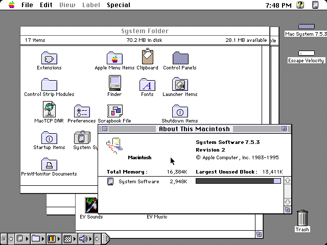 :::
:::
I gravitate towards the ones I came up in, and that's probably not a coincidence. I will say that flat design becomes self-defeating sometimes. Every damn Google icon looks the same.
Memphis design will always win my vote. The weird ass electronics, the ground breaking UI components, just absolutely nutty decisions and insane product concepts built on everyone’s wild dreams of the future. I even think the same forward looking design concepts carried into the Y2K designs— particularly with personal electronics like phones.
Flat design is just soulless crap
Frutiger Aero was best. Not only for beautiful design, but also there were standards people followed on making UI's. Now everything goes. Last time I wanted to register on some shitty website it didn't provide me any feedback that I wrote "weak" password (I copied it from KeePass), except literally green button that you could click like a madman and it didn't do anything but went gray when password was "strong enough".
not sure, but I do know that "flat design" is absolutely the fucking worst.
Memphis design. 30-od years later those cup designs are still lit
Nowadays you'll see some kids wearing sweat suits with that pattern.
Tbh I kinda want a hoodie with it.
"Kids..."
Shit, I'd wear the fuck out of that
It was discontinued only a couple of years ago, so you can still buy that design on Amazon, by the way. It's the SOLO brand Jazz design.
This might as well ask, "When were you young and broke and wanted everything you saw in a commercial and then started collecting ridiculous amounts of nostalgia product as soon as you had even a crumb of disposable income."
Thankfully I didn't fall for that nonsense.
: reclines on throne made entirely of first gen Zunes and Sidekick phones:
Deleted my previous comment, felt like I should give this a bit more attention.
To be honest I feel like all designs are good in their own way. I like the general vibe of Memphis, but being that I was born in the mid 90s, it's probably just that general energy you get from things that happened before you did, where they are "cool" due to how just-old-enough-to-be-old-but-not-old-enough-to-be-an-antique they are, yanno?
Y2K design -- Well. I like the transluscent plastic on Gameboys and Macs. Really underrated aesthetic, wouldn't mind having it back. The DreamCast had some very sleek angles too.
Frutiger Aero will never not "look like the future" to me. It was the age of computer interfaces having all sorts of fun colours and transparencies and animations, and it just LOOKED futuristic and neat. Don't care for the product designs of the era though. That shiny finish would draw in filth and fingerprints from accross the room and after a very short time it'd lose its prettiness.
Flat design I have issues with, like the hamburger menus and the abandonment of descriptive text in favour of abstract icons -- It is also a bit too serious, but I understand and accept that, even if I miss the playfulness of Frutiger. -- But it DID finally bring us dark mode. And my eyes are forever grateful.
... Just wish solarized themes were the norm instead, no idea why they must have such high contrast. I'd even give light mode its time of day if it was a solarized light instead.
Yeah I like the first three for the reasons you gave though flat design’s main issue for me is that it feels empty and corporate but like it thinks it isn’t or it’s trying to hide it. It’s the design opposite of the long form ad. The other designs here had a message and feeling, and yes it was always “futuristic” but this one isn’t. It’s simple without purpose, animated without life, and artistic without message. It’s the art style equivalent of my landlord asking for a quote about “the unique culture and experience of [complex]”.
Compare it to art deco which calls on you to acknowledge the grandiosity of the time. Honestly it could use a modern reinterpretation and revision of something like soviet realism to challenge it.
Aero looks futuristic and sleek.
Best era was actually the 1920s(art nouveau)
I like flat design.
I feel like everyone here just prefers the design they grew up with.
Yeah, the 90s are in style right now. A few years ago, we were all cringing st the styles we wore/had in the 90s. Now it’s hip. In a few years, the early 2000s will be back in style, and everyone will think the 90s is tacky again.
I'm a big fan of flat design, too. To be fair, I basically loved every style in its time. Regardless, I like flat.
I remember being stoked when IOS 7 came out because it looked so much better when the design was overhauled to be flat.
I personally don't like Aero too much. Win 7 looks decent but I prefer the look and simplicity in Windows 10.
Maybe that’s the point of the post. OP wants to know the average age of Lemmits
Early flat design, around the WP7 era, was good. Modern flat design has a lot of wasted space and a lack of descriptive text :<
Later
I don't think the underlying reason is what year I turned fifteen, but Flat can go fuck itself. Just awful usability all around. Even Windows 95 managed relief shading, and it could do that shit in sixteen colors. White on white with white dividers is the nonsense you put in movies.
The next generation of design is already taking shape. It's a simplistic skewmorphic design, where it looks like the logo has been made out of clay. Look at the new Reddit and Android logo.
So basically IOS's design language prior to IOS 7
90s because they used logic in designing things. Now they change for the sake of change.
Like how there was a damn good reason for the start menu button to be on the button right: you could fling your mouse the lower left and no matter if you did it too far or fast, it would always hit the corner, and be at the start button. You never had to "target" the start button, you simply went all the way down to the left. Didn't even have to look.
So obviously, they must of had an equally smart, thoughtful reason to put it in the middle, right? That's a decision born from utility, not aesthetics. Clearly not making a painfully obvious attempt at copying their main competitor.
What on earth are you talking about? What start button is in the middle?
Windows 11 Windows button is now in the middle of the taskbar, as opposed to where it's been for literally 30 years.
Although you can change it to be bottom left again. But it should be the default.
I think this is about windows 11 and Microsoft's stupid decision to move the start menu to the middle
Y2K would like to have a word...
Y2K was fine. We fixed it in the '90s, it employed practically the entire tech workforce for all of '98 and '99. It made it so easy to get into that industry for people like me
Y2k and frutiger aero and transition between the two was the blast
I was remarking the other day about how much character the main menus have on the Wii and Wii U, while the Switch is dead and lifeless
augh jazz cup my beloved. I wish we had loud baggy pants like that again.
I just bought myself a pair of parachute pants! They're not nearly as loud as the wind breaker suits of the 90s and early 00s, but I love them.
All eras have some grace? But the best was art deco.
Hey that's a nice ilustration!
I grew up in the 90s but I actually quite prefer aero design, idk, everything just felt so new and modern
Frutiger and Y2K for sure
90s, BeOS
Y2k was a really exiting phase, but my nostalgia lives for the late 80s and early 90s. But who is the asshole who did neither include a C64, not an Amiga in this?
Probably someone outside of Europe, that was Commodores main market. Especially the Amiga generation.
Right?? And the MSX too.
agreed
Y2K is my number one. Memphis on the second place, frutiger aero on third. Flat design is on the last place because it sucks.
I know I shouldn't be disappointed it hasn't already been said, but uh.. rap music really came into its own in the 90s. Also, you know.. was probably the peak as well.
I miss hip hop
It's about 30% of what I listen to. A lot of ATCQ, Digable Planets, Wu-Tang Clan and such.
Twinz by Fat Joe and Big Pun is almost on repeat for me, as well.
Here is an alternative Piped link(s):
Twinz
Piped is a privacy-respecting open-source alternative frontend to YouTube.
I'm open-source; check me out at GitHub.
Tbh I kinda like flat design if done tastefully and within a confined scope, but that Alegria/Globo Homo bullshit from evil corporations and the weird full plastic boxes of nothing can rightly go to the dump.
I will hate the decade though for its prevalence of the bland beige and off-white interior design.
The Nintendo Switch theme is the most boring shit I have ever seen in a recent handheld... At least it can be improved if you have it hacked... But 3DS were much better, anytime I open it up and the Phoenix Wright or Hotel Dusk BGM start to hit is the real deal!
Frutiger Aero is my favourite.
No love for paleolithic design?
I like the 2015-2024 design
I loved XP. Hope to see more linux layouts like that.
Aero is my favorite. I think it looks nice
Best aesthetic is Cassette Futurism
CC BY-NC-SA 4.0
Translucent electronics FTW
I'd say that it was the 80s, because most types of art peaked in 1984 (in terms of cultural significance).
I agree, and also the 1984 David Lynch Dune movie was the pinnacle of film making.
Peak design was late 90s and 2000s, where you got to see the new crazy designs of a new era while 80s design still existed all around you prevalently. That fusion is peak nostalgia for me.
Frutiger with the first 3Ds wins everything for me
Frutiger is the perfect mix of streamlined and personality, with a softness to make you feel like you aren't dying.
I'm between frutiger aero and Y2K
I'd say PS2 belongs in flat design, even if it falls outside the dates they think: its design language was ahead of its time
And the PS5 isn't really flat design, especially compared to the current Xbox.
Not a fan of the early windows style, but otherwise "Memphis" looks coolest to me. Reminds me of early nickelodeon. The crowd in the background of What Would You Do was 100% this style.
Oh definitley frutiger aero.
Was the 3DS (main menu) really frutiger? Feels like a far cry compared to Win7 and the xbox 360
It doesn't have quite as much "gloss", but what puts it in that era for me is the beveled and 3d elements that disqualify it from being "flat". Some of its design elements were also semi-skeuomorphic.
Then what's Win11, Arc, that style?
Late 90s decided that everyone had to dress up in silver
They all look good
memphis & flat
The music. The early 90s saw the rise of independent record labels which then gave rise to bands who wouldn't have stood a chance otherwise, aka Indie Music. After the 60s, the 90s is by far the best era for modern music ever.
I love the excess of the Y2K Era. Everything was so much more beautiful, unique, and strange. Everything after seemed like an attempt to "dial it back."
Y2K. Let me just run this chromium look filter on my pillow embossing.
Strange, just for the last few days, I've been thinking just what a big cultural turning point 2005 seemed to be. From then on, everything started to circle the drain, and I put the blame on globalization and the advent of large-scale social media. Which might have left an imprint on product design and fashion.
And, as I wrote earlier in a different thread, the shift from 1994 to 1995 was the biggest one I've witnessed, and it was very visible in public spaces. Audible as well: It went from Metallica and ZZ Top as supermarket background music (imagine this!) to "Easy Listening" or whatever.
Flat design definitely looks the cleanest, most simple and pleasing to the eye.
"Don't go chasing waterfalls."
Gaming hasn't really bloomed as much as it had in the 2000s